[R data.table] 선형회귀 모델의 오른쪽 부분(model's right-hand side)의 변수 조합을 간단하게 다루기
R 분석과 프로그래밍/R 데이터 전처리 2021. 1. 31. 23:19지난 포스팅에서는 R data.table 패키지에서 .SD 가 무엇이고, .SD와 .SDcols 를 사용해서 특정 칼럼만을 가져오는 방법(을 소개하였습니다. 그리고 lapply()도 같이 사용해서 여러개의 칼럼의 데이터 유형을 변환하는 방법도 같이 설명하였습니다. (rfriend.tistory.com/608)
이번 포스팅에서는 지난 포스팅에 이어서, R data.table의 .SD, .SDcols와 lapply(), combn() 함수를 같이 사용하여 '선형회귀 모델의 오른쪽 부분에 여러 변수의 모든 가능한 조합을 적용하여 다루는 방법'을 소개하겠습니다.
(1) 설명변수 간 모든 가능한 조합 만들기: combn(x, m, simplify = TRUE, ...)
(2) 설명변수 간 모든 가능한 조합으로 선형회귀모델 적합하여 회귀계수 가져오기
(3) 설명변수 조합별 회귀계수로 막대그래프 그리기: barplot()
만약 모델에서 사용하는 칼럼의 개수가 몇 개 안된다면 수작업으로 일일이 변수 이름을 나열해서 적어주면 됩니다. 하지만, 모델에서 사용하는 칼럼 개수가 수십개인 경우(** 몇 개의 칼럼 간의 조합을 사용하는 경우 기하급수적으로 칼럼 개수가 늘어남)에는 키보드를 쳐가면서 일일이 변수 이름(조합)을 나열하기가 시간도 오래 걸리고, 오타 에러를 유발할 위험도 높아집니다. 이럴 경우에 이번에 소개하는 내용이 매우 유용하고 간편하게 사용될 수 있습니다.
먼저, data.table 패키지를 불러오고, 예제로 사용할 데이터로 Lahman 패키지에 들어있는 야규 투구 통계 데이터인 'Pitching' 데이터셋을 Data.Table로 만들어보겠습니다.
library(data.table)

## Lahman database on baseball
#install.packages("Lahman")
library(Lahman)
data("Pitching")
setDT(Pitching)
str(Pitching)
# Classes 'data.table' and 'data.frame':	47628 obs. of  30 variables:
#   $ playerID: chr  "bechtge01" "brainas01" "fergubo01" "fishech01" ...
# $ yearID  : int  1871 1871 1871 1871 1871 1871 1871 1871 1871 1871 ...
# $ stint   : int  1 1 1 1 1 1 1 1 1 1 ...
# $ teamID  : Factor w/ 149 levels "ALT","ANA","ARI",..: 97 142 90 111 90 136 111 56 97 136 ...
# $ lgID    : Factor w/ 7 levels "AA","AL","FL",..: 4 4 4 4 4 4 4 4 4 4 ...
# $ W       : int  1 12 0 4 0 0 0 6 18 12 ...
# $ L       : int  2 15 0 16 1 0 1 11 5 15 ...
# $ G       : int  3 30 1 24 1 1 3 19 25 29 ...
# $ GS      : int  3 30 0 24 1 0 1 19 25 29 ...
# $ CG      : int  2 30 0 22 1 0 1 19 25 28 ...
# $ SHO     : int  0 0 0 1 0 0 0 1 0 0 ...
# $ SV      : int  0 0 0 0 0 0 0 0 0 0 ...
# $ IPouts  : int  78 792 3 639 27 3 39 507 666 747 ...
# $ H       : int  43 361 8 295 20 1 20 261 285 430 ...
# $ ER      : int  23 132 3 103 10 0 5 97 113 153 ...
# $ HR      : int  0 4 0 3 0 0 0 5 3 4 ...
# $ BB      : int  11 37 0 31 3 0 3 21 40 75 ...
# $ SO      : int  1 13 0 15 0 0 1 17 15 12 ...
# $ BAOpp   : num  NA NA NA NA NA NA NA NA NA NA ...
# $ ERA     : num  7.96 4.5 27 4.35 10 0 3.46 5.17 4.58 5.53 ...
# $ IBB     : int  NA NA NA NA NA NA NA NA NA NA ...
# $ WP      : int  7 7 2 20 0 0 1 15 3 44 ...
# $ HBP     : int  NA NA NA NA NA NA NA NA NA NA ...
# $ BK      : int  0 0 0 0 0 0 0 2 0 0 ...
# $ BFP     : int  146 1291 14 1080 57 3 70 876 1059 1334 ...
# $ GF      : int  0 0 0 1 0 1 1 0 0 0 ...
# $ R       : int  42 292 9 257 21 0 30 243 223 362 ...
# $ SH      : int  NA NA NA NA NA NA NA NA NA NA ...
# $ SF      : int  NA NA NA NA NA NA NA NA NA NA ...
# $ GIDP    : int  NA NA NA NA NA NA NA NA NA NA ...
# - attr(*, ".internal.selfref")=<externalptr>
(1) 설명변수 간 모든 가능한 조합 만들기: combn(x, m, simplify = TRUE, ...)
먼저, 코드 이해를 돕기 위해서 utils 패키지의 combn(x, m, simplify = TRUE, ...) 함수에 대해서 설명하겠습니다.
combn() 함수는 투입되는 객체 x 내 원소들 간의 m 개로 이루어진 모든 가능한 조합을 만들어줍니다. 이때 simplify = TRUE (default 설정) 이면 바로 아래의 예처럼 행렬(matrix), 배열(array) 형태로 간소화해서 조합의 결과를 나타내주며, simplify = FALSE 로 설정해주면 두번째 예처럼 원소 간 조합의 결과를 리스트(list) 형태로 해서 위에서 아래로 길게 나타내줍니다.
## combn {utils}
## : combn(x, m, FUN = NULL, simplify = TRUE, ...)
## : Generate all combinations of the elements of 'x' taken 'm' at a time
combn(x = letters[1:4], m = 2)
# [,1] [,2] [,3] [,4] [,5] [,6]
# [1,] "a"  "a"  "a"  "b"  "b"  "c"
# [2,] "b"  "c"  "d"  "c"  "d"  "d"


## simplify = FALSE : returns the combinations in a list format
combn(x = letters[0:4], m = 2, simplify = FALSE)
# [[1]]
# [1] "a" "b"
#
# [[2]]
# [1] "a" "c"
#
# [[3]]
# [1] "a" "d"
#
# [[4]]
# [1] "b" "c"
#
# [[5]]
# [1] "b" "d"
#
# [[6]]
# [1] "c" "d"
앞에서 combn() 함수로 인풋 x 의 모든 원소 간 조합을 만들 수 있다는 것을 알았으므로, 이제 c('yearID', 'teamID', 'G', 'L') 의 4개 설명변수 간 모든 조합을 만들어보겠습니다. 이때 m=0~4 (설명변수 개수) 까지 바꾸어가면서 lapply() 로 combn() 함수에 x = c('yearID', 'teamID', 'G', 'L') 의 4개 원소를 가진 인풋을 적용해서 가능한 모든 조합을 만들어보겠습니다. 그리고 조합의 결과를 unlist() 해서 아래의 models 결과처럼 각 조합이 문자형 벡터(character vector)로 해서 차곡 차곡 리스트에 묶여있도록 하겠습니다.
## this generates a list of the 2^k possible extra variables
## for models of the form ERA ~ G + (...)
extra_var <- c('yearID', 'teamID', 'G', 'L')
models <- unlist(
  lapply(0L:length(extra_var), combn, x = extra_var, simplify = FALSE),
  recursive = FALSE # the function will not recurse beyond the first level items in x
)

models
# [[1]]
# character(0)
#
# [[2]]
# [1] "yearID"
#
# [[3]]
# [1] "teamID"
#
# [[4]]
# [1] "G"
#
# [[5]]
# [1] "L"
#
# [[6]]
# [1] "yearID" "teamID"
#
# [[7]]
# [1] "yearID" "G"
#
# [[8]]
# [1] "yearID" "L"
#
# [[9]]
# [1] "teamID" "G"
#
# [[10]]
# [1] "teamID" "L"
#
# [[11]]
# [1] "G" "L"
#
# [[12]]
# [1] "yearID" "teamID" "G"
#
# [[13]]
# [1] "yearID" "teamID" "L"
#
# [[14]]
# [1] "yearID" "G"      "L"
#
# [[15]]
# [1] "teamID" "G"      "L"
#
# [[16]]
# [1] "yearID" "teamID" "G"      "L"
위의 lapply() 와 combn() 함수를 같이 쓴 코드가 잘 이해가 안가신다면, 바로 아래처럼 m=0~4 까지 일일이 반복적으로 길게 쓴 코드를 lapply() 사용해서 좀더 간결하게 쓴 것이 위의 코드라고 생각하면 되겠습니다.
## or, equivalently by manual
unlist(
  list(
    combn(x=extra_var, m=0, simplify=F),
    combn(x=extra_var, m=1, simplify=F),
    combn(x=extra_var, m=2, simplify=F),
    combn(x=extra_var, m=3, simplify=F),
    combn(x=extra_var, m=4, simplify=F)
  ),
  recursive = FALSE
)
(2) 설명변수 간 모든 가능한 조합으로 선형회귀모델 적합하여 회귀계수 가져오기
R에서 선형회귀모형은 lm(y ~ x, data) 형태의 구문을 사용합니다. 그리고 coef(lm(y ~ x, data)) 로 적합된 회귀모형의 회귀계수에 접근할 수 있습니다.
아래의 Pitching[ , coef(lm(ERA ~ ., data = .SD))['W'], .SDcols = c('W', rhs)] 코드가 무척 어려워보일 수 있는데요, 하나씩 설명해보자면요, data = .SD, .SDcols = c('W', rhs) 는 Pitching 데이터셋을 참조해서 .SDcols 에 있는 칼럼(즉, 'W' 변수와 (1)번에서 만든 models 설명변수 조합에 해당하는 rhs 변수들)만 선별해서 가져오라는 뜻입니다. 이들 설명변수 조합을 사용해 lm(ERA ~ .) 로 회귀모형을 적합하며, coef(lm(ERA ~ ., data=.SD))['W'] 는 변수 'W'의 적합된 추정 회귀계수를 가져오라는 뜻입니다.
## -- coefficient of 'W' from linear regression model
## using ERA ~ . and data = .SD, then varying which
##   columns are included in .SD allows us to perform this
##   iteration over 16 models succinctly.
##   coef(.)['W'] extracts the W coefficient from each model fit
lm_coef = sapply(models, function(rhs) {
  Pitching[ , coef(lm(ERA ~ ., data = .SD))['W'], .SDcols = c('W', rhs)]
})


## coefficients of 'W' from the linear regression models above
lm_coef
# W           W           W           W           W           W           W           W
# -0.20643825 -0.20877606 -0.20763604 -0.11362170 -0.18675857 -0.20689003 -0.09819310 -0.18763789
# W           W           W           W           W           W           W           W
# -0.10765791 -0.18214290 -0.12478923 -0.09595359 -0.18197728 -0.11646014 -0.11793832 -0.11143365
위의 sapply() 함수와 .SD, .SDcols 를 사용하지 않고 각 설명변수 16개 조합별로 일일이 수작업으로 회귀모형을 나열해서 적으려면 아래처럼 단순 작업을 여러번 해야 합니다. 시간도 오래걸리고, 또 오타 에러를 낼 위험이 높습니다.
## all combinations of linear regression models by manually
Pitching[ , coef(lm(ERA ~ ., data = .SD))['W'], .SDcols = c('W')]
Pitching[ , coef(lm(ERA ~ ., data = .SD))['W'], .SDcols = c('W', 'yearID')]
Pitching[ , coef(lm(ERA ~ ., data = .SD))['W'], .SDcols = c('W', 'teamID')]
Pitching[ , coef(lm(ERA ~ ., data = .SD))['W'], .SDcols = c('W', 'G')]
Pitching[ , coef(lm(ERA ~ ., data = .SD))['W'], .SDcols = c('W', 'L')]
Pitching[ , coef(lm(ERA ~ ., data = .SD))['W'], .SDcols = c('W', 'yearID', 'teamID')]
Pitching[ , coef(lm(ERA ~ ., data = .SD))['W'], .SDcols = c('W', 'yearID', 'G')]
Pitching[ , coef(lm(ERA ~ ., data = .SD))['W'], .SDcols = c('W', 'yearID', 'L')]
Pitching[ , coef(lm(ERA ~ ., data = .SD))['W'], .SDcols = c('W', 'teamID', 'G')]
Pitching[ , coef(lm(ERA ~ ., data = .SD))['W'], .SDcols = c('W', 'teamID', 'L')]
Pitching[ , coef(lm(ERA ~ ., data = .SD))['W'], .SDcols = c('W', 'G', 'L')]
Pitching[ , coef(lm(ERA ~ ., data = .SD))['W'], .SDcols = c('W', 'yearID', 'teamID', 'G')]
Pitching[ , coef(lm(ERA ~ ., data = .SD))['W'], .SDcols = c('W', 'yearID', 'teamID', 'L')]
Pitching[ , coef(lm(ERA ~ ., data = .SD))['W'], .SDcols = c('W', 'yearID', 'G', 'L')]
Pitching[ , coef(lm(ERA ~ ., data = .SD))['W'], .SDcols = c('W', 'teamID', 'G', 'L')]
Pitching[ , coef(lm(ERA ~ ., data = .SD))['W'], .SDcols = c('W', 'yearID', 'teamID', 'G', 'L')]
(3) 설명변수 조합별 회귀계수로 막대그래프 그리기: barplot()
위의 (2)번에서 구한 각 설명변수 16개 조합별 변수 'W'의 회귀계수를 가지고 barplot() 함수를 사용해서 막대그래프(bar plot)를 그려보겠습니다.
여기서도 'W' 회귀계수가 적합되었을 때 각 모델별로 사용되었던 설명변수 조합을 names.arg = sapply(models, paste, collapse = '/') 로 해서 넣어주었습니다.
## -- barplot
# here are 16 visually distinct colors, taken from the list of 20 here:
#   https://sashat.me/2017/01/11/list-of-20-simple-distinct-colors/
col16 = c('#e6194b', '#3cb44b', '#ffe119', '#0082c8',
          '#f58231', '#911eb4', '#46f0f0', '#f032e6',
          '#d2f53c', '#fabebe', '#008080', '#e6beff',
          '#aa6e28', '#fffac8', '#800000', '#aaffc3')

par(oma = c(2, 0, 0, 0))

barplot(lm_coef, names.arg = sapply(models, paste, collapse = '/'),
        main = "Wins coefficient\n With various covariates",
        col = col16, las = 2L, cex.names = .8)
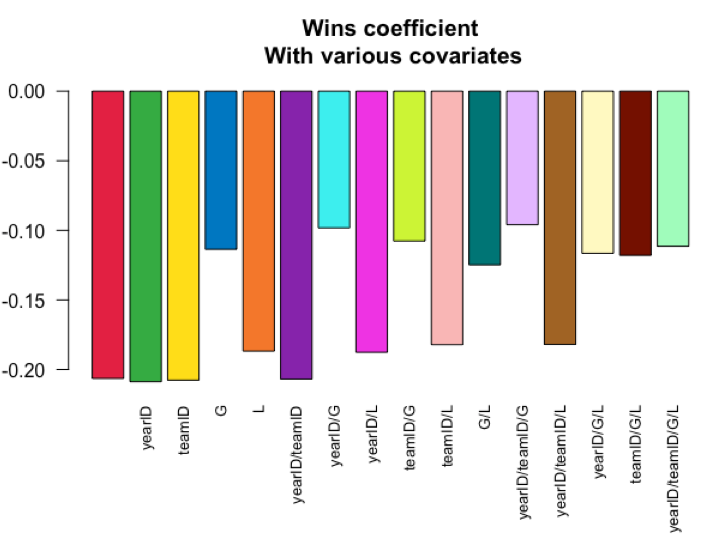
참고로, paste() 함수로 'models' 리스트에 들어있는 변수 이름들의 조합을 하나의 합칠 때, collpase = '/' 를 설정해주면 아래처럼 각 리스트 원소 내 여러개의 변수 이름을 하나로 합치면서 사이에 '/'를 넣어줍니다. (paste 함수에서 sep와 collapse 의 차이점은 여기를 참고하세요.)
sapply(models, paste, collapse = '/')
# [1] ""                  "yearID"            "teamID"            "G"                 "L"
# [6] "yearID/teamID"     "yearID/G"          "yearID/L"          "teamID/G"          "teamID/L"
# [11] "G/L"               "yearID/teamID/G"   "yearID/teamID/L"   "yearID/G/L"        "teamID/G/L"
# [16] "yearID/teamID/G/L"
[ Reference ]
* R data.table vignettes 'Using .SD for Data Analysis'
: cran.r-project.org/web/packages/data.table/vignettes/datatable-sd-usage.html
이번 포스팅이 많은 도움이 되었기를 바랍니다.
행복한 데이터 과학자 되세요! :-)

728x90
반응형
'R 분석과 프로그래밍 > R 데이터 전처리' 카테고리의 다른 글
| [R data.table] .SD[], by를 사용해 그룹별로 부분집합 가져오기 (Group Subsetting) (0) | 2021.01.31 |
|---|---|
| [R data.table] 조건이 있는 상태에서 Key를 기준으로 데이터셋 합치기 (Conditional Joins) (0) | 2021.01.31 |
| [R data.table] .SDcols 로 일부 칼럼 가져오기 (Column subsetting using .SDcols) (6) | 2021.01.31 |
| [R data.table] 그룹별 관측치 개수 별로 DataTable을 구분해서 생성하기 (0) | 2021.01.30 |
| [R dplyr] 그룹별 관측치 개수 별로 DataFrame을 구분해서 생성하기 (0) | 2021.01.30 |


