[Python matplotlib] 여러개의 하위 플롯 간격을 조절해서 붙이고, X축, Y축을 공유해서 시각화하기
Python 분석과 프로그래밍/Python 그래프_시각화 2021. 11. 21. 20:56여러개의 그래프를 위/아래 또는 왼쪽/오른쪽으로 붙여서 시각화를 한 후에 비교를 해보고 싶을 때가 있습니다. 그리고 측정 단위가 서로 같을 경우에는 x축, y축을 여러개의 그래프와 공유하면서 동일한 scale의 눈금으로 시각화 함으로써 그래프 간 비교를 더 쉽고 정확하게 할 수 있습니다.
이번 포스팅에서는
(1) 여러개의 하위 플롯 그리기: plt.subplots(nrows=2, ncols=2)
(2) X축과 Y축을 공유하기
: plt.subplots(sharex=True. sharey=True)
(3) 여러개의 하위 플롯들 간의 간격을 조절해서 붙이기
: (3-1) plt.subplots_adjust(wspace=0, hspace=0)
: (3-2) plt.tight_layout(h_pad=-1, w_pad=-1)
하는 방법을 소개하겠습니다.
(1) 여러개의 하위 플롯 그릭: plt.subplots(nrows=2, ncols=2)
먼저, plt.subplots(nrows=2, ncols=2) 로 2개 행, 2개 열의 layout 을 가지는 하위 플롯을 그려보겠습니다. 평균=0, 표준편차=1을 가지는 표준정규분포로 부터 100개의 난수를 생성해서 파란색(color='b')의 약간 투명한(alpha=0.5) 히스토그램을 그려보겠습니다.
for loop 을 돌면서 2 x 2 의 레이아웃에 하위 플롯이 그려질때는 왼쪽 상단이 1번, 오른쪽 상단이 2번, 왼쪽 하단이 3번, 오른쪽 하단이 4번의 순서로 하위 그래프가 그려집니다.
이렇게 하위 플롯이 그려질 때 자동으로 하위 플롯 간 여백(padding)을 두고 그래프가 그려지며, X축과 Y축은 공유되지 않고 각각 축을 가지고 그려집니다.
import numpy as np
import pandas as pd
import matplotlib.pyplot as plt

## subplots with 2 by 2
## (1) there are paddings between subplots
## (2) x and y axes are not shared
fig, axes = plt.subplots(
    nrows=2,
    ncols=2,
    figsize=(10, 10))

for i in range(2):
    for j in range(2):
        axes[i, j].hist(
            np.random.normal(loc=0, scale=1, size=100),
            color='b',
            alpha=0.5)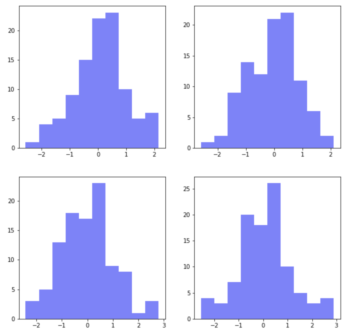
(2) X축과 Y축을 공유하기
: plt.subplots(sharex=True. sharey=True)
(3) 여러개의 하위 플롯들 간의 간격을 조절해서 붙이기
: (3-1) plt.subplots_adjust(wspace=0, hspace=0)
여러개의 하위 플롯 간에 X축과 Y축을 공유하려면 plt.subplots()의 옵션 중에서 sharex=True, sharey=True를 설정해주면 됩니다.
그리고 하위 플롯들 간의 간격을 없애서 그래프를 서로 붙여서 그리고 싶다면 두가지 방법이 있습니다. 먼저, plt.subplots_adjust(wspace=0, hspace=0) 에서 wspace 는 폭의 간격(width space), hspace 는 높이의 간격(height space) 을 설정하는데 사용합니다.
fig, axes = plt.subplots(
    nrows=2, ncols=2,
    sharex=True, # sharing properties among x axes
    sharey=True, # sharing properties among y axes
    figsize=(10, 10))

for i in range(2):
    for j in range(2):
        axes[i, j].hist(
            np.random.normal(loc=0, scale=1, size=100),
            color='b',
            alpha=0.5)

## adjust the subplot layout
plt.subplots_adjust(
    wspace=0, # the width of the padding between subplots
    hspace=0) # the height of the padding between subplots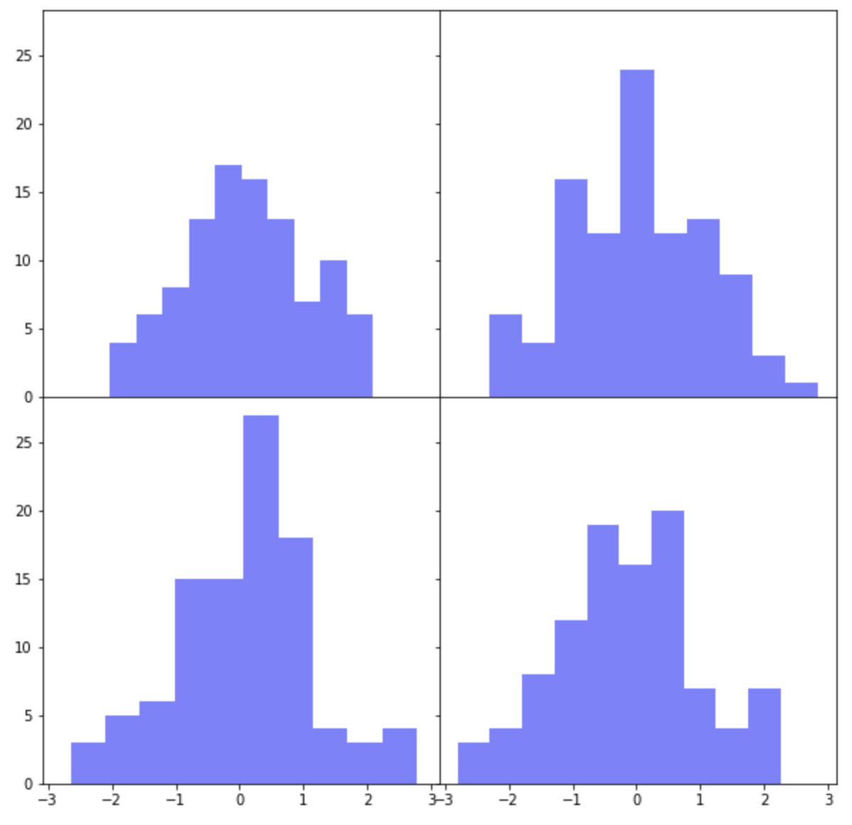
아래 예제에서는 plt.subplots(sharex=False, sharey=True) 로 해서 X축은 공유하지 않고 Y축만 공유하도록 했습니다.
그리고 plt.subplots_adjust(wspace=0, hspace=0.2) 로 해서 높이의 간격(height space)에만 0.2 만큼의 간격을 부여해주었습니다.
fig, axes = plt.subplots(
    nrows=2, ncols=2,
    sharex=False, # sharing properties among x axes
    sharey=True, # sharing properties among y axes
    figsize=(10, 10))

for i in range(2):
    for j in range(2):
        axes[i, j].hist(
            np.random.normal(loc=0, scale=1, size=100),
            color='b',
            alpha=0.5)

## adjust the subplot layout
plt.subplots_adjust(
    wspace=0, # the width of the padding between subplots
    hspace=0.2) # the height of the padding between subplots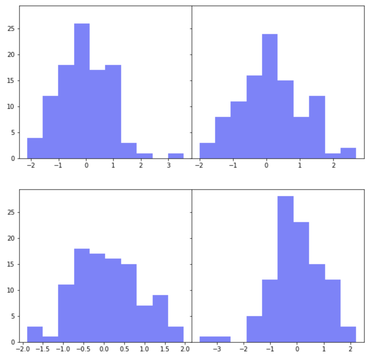
(3) 여러개의 하위 플롯들 간의 간격을 조절해서 붙이기
: (3-2) plt.tight_layout(h_pad=-1, w_pad=-1)
하위 플롯 간 간격을 조절하는 두번째 방법으로는 plt.tight_layout(h_pad, w_pad) 을 사용하는 방법입니다. plt.tight_layout(h_pad=-1, w_pad=-1)로 설정해서 위의 2번에서 했던 것처럼 4개의 하위 플롯 간에 간격이 없이 모두 붙여서 그려보겠습니다. (참고: h_pad=0, w_pad=0 으로 설정하면 하위 플롯간에 약간의 간격이 있습니다.)
fig, axes = plt.subplots(
    nrows=2, ncols=2,
    sharex=True, # sharing properties among x axes
    sharey=True, # sharing properties among y axes
    figsize=(10, 10))

for i in range(2):
    for j in range(2):
        axes[i, j].hist(
            np.random.normal(loc=0, scale=1, size=100),
            color='b',
            alpha=0.5)

## adjusting the padding between and around subplots
plt.tight_layout(
    h_pad=-1, # padding height between edges of adjacent subplots
    w_pad=-1) # padding width between edges of adjacent subplots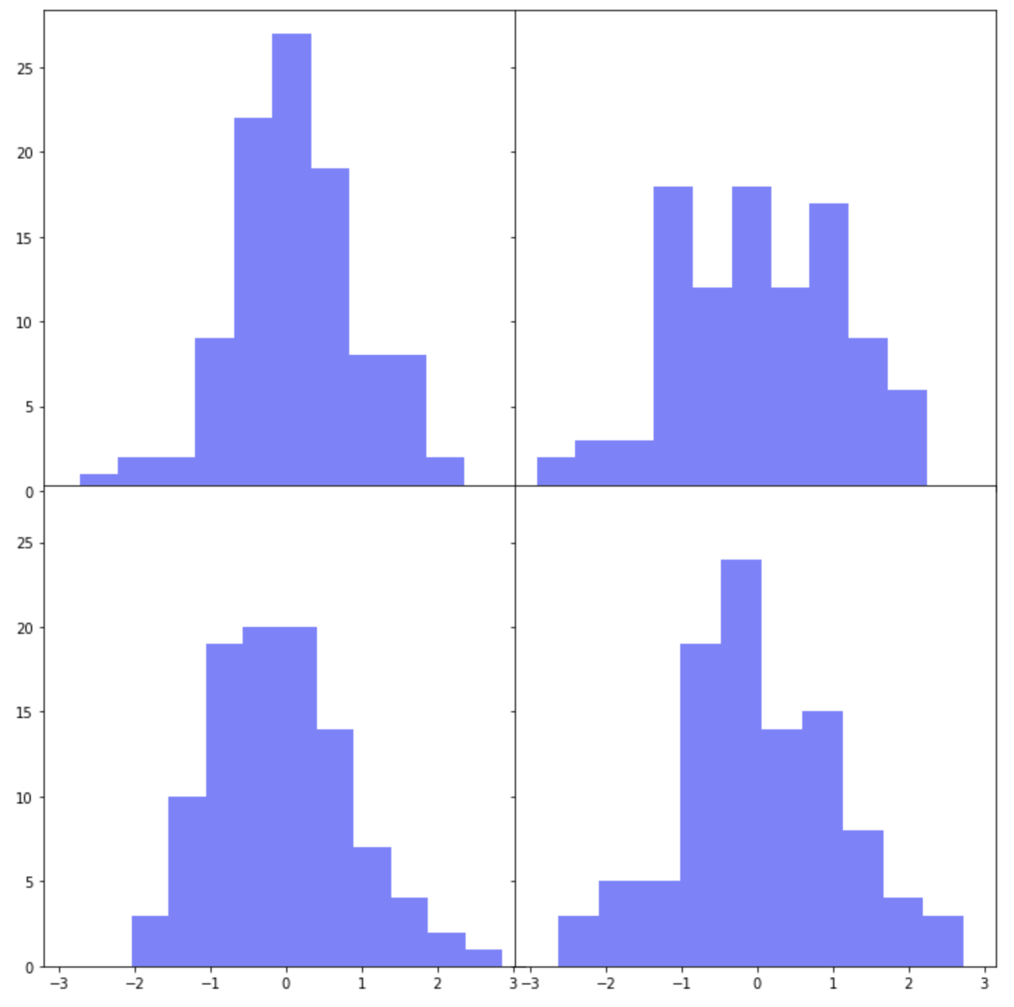
X축은 공유하지 않고 Y축만 공유하며, plt.tight_layout(h_pad=3, w_pad=0) 으로 설정해서 높이 간격을 벌려보겠습니다. 그리고 하위 플롯이 그려지는 순서대로 'blue', 'red', 'yellow', 'black' 의 색깔을 입혀보겠습니다.
fig, axes = plt.subplots(
    nrows=2, ncols=2,
    sharex=False, # sharing properties among x axes
    sharey=True, # sharing properties among y axes
    figsize=(10, 10))

color = ['blue', 'red', 'yellow', 'black']
k=0
for i in range(2):
    for j in range(2):
        axes[i, j].hist(
            np.random.normal(loc=0, scale=1, size=100),
            color=color[k],
            alpha=0.5)
        k +=1

## adjusting the padding between and around subplots
plt.tight_layout(
    h_pad=3, # padding height between edges of adjacent subplots
    w_pad=0) # padding width between edges of adjacent subplots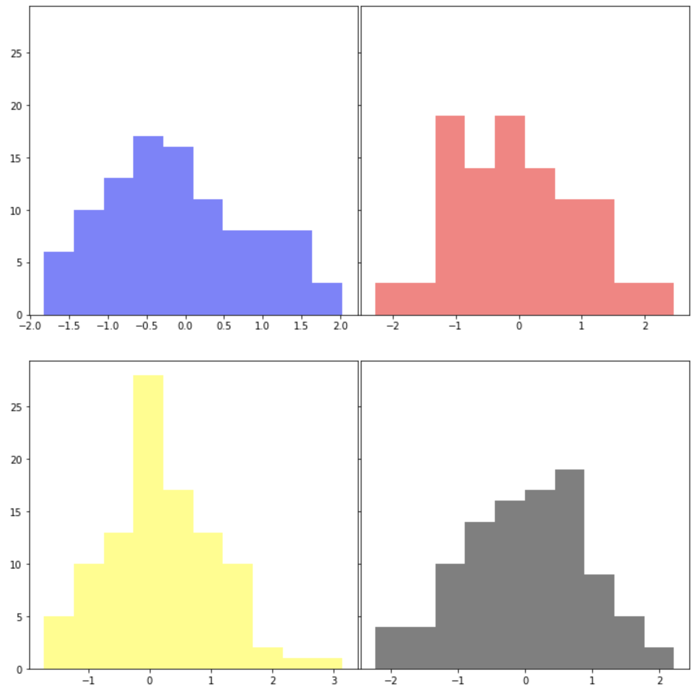
[ Reference ]
- plt.subplots(): https://matplotlib.org/stable/api/_as_gen/matplotlib.pyplot.subplots.html
- plt.subplots_adjust(): https://matplotlib.org/stable/api/_as_gen/matplotlib.pyplot.subplots_adjust.html
- plt.tight_layout(): https://matplotlib.org/stable/api/_as_gen/matplotlib.pyplot.tight_layout.html
이번 포스팅이 많은 도움이 되었기를 바랍니다.
행복한 데이터 과학자 되세요!