이번 포스팅에서는 Python의 Plotly 모듈을 이용해서 클리브랜드 점 그래프 (Cleveland Dot Plot in Python using Plotly) 그리는 방법을 소개하겠습니다. 


Cleveland and McGill (1984) 이  “Graphical Methods for Data Presentation: Full Scale Breaks, Dot Charts, and Multibased Logging.” 이라는 논문에서 막대 그래프 대비 점 그래프가 데이터 해석, 가독성에서 가지는 우수성을 소개하면서 Cleveland Dot Plot 이라고도 많이 불리는 그래프입니다.


예제로 사용할 데이터로, "학교(schools)" 범주형 변수의 졸업생 별 남성(men)과 여성(women)의 수입(earning) 데이터로 pandas DataFrame을 만들어보겠습니다. 


## making a sample pandas DataFrame
import pandas as pd

df = pd.DataFrame({
    'schools': [
        "Brown", "NYU", "Notre Dame", "Cornell", "Tufts", "Yale",
        "Dartmouth", "Chicago", "Columbia", "Duke", "Georgetown",
        "Princeton", "U.Penn", "Stanford", "MIT", "Harvard"],
    'earnings_men': [
        92, 94, 100, 107, 112, 114, 114, 118, 119, 124, 131, 137, 141, 151, 152, 165], 
    'earnings_women': [
        72, 67, 73, 80, 76, 79, 84, 78, 86, 93, 94, 90, 92, 96, 94, 112]
})


print(df)
#        schools  earnings_men  earnings_women
# 0        Brown            92              72
# 1          NYU            94              67
# 2   Notre Dame           100              73
# 3      Cornell           107              80
# 4        Tufts           112              76
# 5         Yale           114              79
# 6    Dartmouth           114              84
# 7      Chicago           118              78
# 8     Columbia           119              86
# 9         Duke           124              93
# 10  Georgetown           131              94
# 11   Princeton           137              90
# 12      U.Penn           141              92
# 13    Stanford           151              96
# 14         MIT           152              94

# 15     Harvard           165             112


Plotly 의 graph_objects 메소드를 사용해서 졸업한 학교(schools) 별 남성의 수입(earnings_men)과 여성의 수입(earnings_women) 에 대해서 점으로 마킹을 하고 수입을 텍스트로 표기 (mode="markers + text") 하여 클리브랜드 점 그래프 (Cleveland Dot Plot)을 그려보겠습니다. 


import plotly.graph_objects as go

fig = go.Figure()

## Dot Plot for Men
fig.add_trace(go.Scatter(
    x=df['earnings_men'],
    y=df['schools'],
    marker=dict(color="red", size=10),
    mode="markers + text",
    name="Men",
    text=df['earnings_men'],
    textposition="middle right"
))

## Dot Plot for Women
fig.add_trace(go.Scatter(
    x=df['earnings_women'],
    y=df['schools'],
    marker=dict(color="blue", size=10),
    mode="markers + text",
    name="Women",
    text=df['earnings_women'],
    textposition="middle left"
))

## title and axis title
fig.update_layout(
    title="Earnings by School and Gender",
    xaxis_title="Annual Salary (in thousands)",
    yaxis_title="School")


fig.show()

Cleveland Dot Plot in Python using Plotly


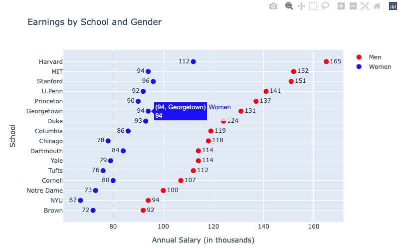
Plotly 그래프는 interactive mode 로서 마우스 커서를 그래프에 가져다대면 해당 점의 정보가 팝업으로 나타나서 편리하게 볼 수 있습니다. 


R의 ggplot2 패키지를 이용한 클리브랜드 점 그래프 (Cleveland Dot Plot in R using ggplot2) 그리는 방법은 https://rfriend.tistory.com/75 를 참고하세요. 


이번 포스팅이 많은 도움이 되었기를 바랍니다. 

행복한 데이터 과학자 되세요!  :-)


728x90
반응형
Posted by Rfriend
,

페이스북의 KRUG (Korean R User Group) 에서 2017.11.18일 주말 퀴즈로 아래의 시각화를 푸는 문제가 있어서 재미로 풀어보았습니다. 


처음엔 금방 코드 짤 것으로 예상했는데요, 출제자분께서 중간 중간 장애물을 심어놓으셔서 제 예상보다 좀 더 걸렸네요. 


문제 풀면 KRUG 운영자분께서 스타벅스 기프티콘 주신다고 하는데요, 기대되네요. ^___^


# KRUG's plot quiz, as of 18th NOV. 2017


library(ggplot2)

#install.packages("dplyr")

library(dplyr)

str(mtcars)


# making 'model' variable

mtcars$model <- rownames(mtcars)


# ordering by cyl, hp

mtcars_ord <- arrange(mtcars[,c('model', 'cyl', 'hp')], cyl, desc(hp))


# marking an inflection point within cluster : threshold >= 40

mtcars_cyl <- c(4, 6, 8)

mtcars_ord_2 <- data.frame()


for (i in 1:length(mtcars_cyl)) {


  mtcars_tmp <- subset(mtcars_ord, subset = (cyl == mtcars_cyl[i]))


  for (j in 1:nrow(mtcars_tmp)) {

    if (j != nrow(mtcars_tmp) & mtcars_tmp$hp[j] - mtcars_tmp$hp[j+1] >= 40) {

      mtcars_tmp$hp_outlier[j] = '1_outlier'

    } else {

      mtcars_tmp$hp_outlier[j] = '2_normal'

    }

  }


  mtcars_ord_2 <- rbind(mtcars_ord_2, mtcars_tmp)

  rm(mtcars_tmp)

}


# converting cyl variable type from numeric to factor

mtcars_ord_2$cyl_cd <- paste0("cyl :", mtcars_ord_2$cyl)


model_order <- mtcars_ord_2$model[order(mtcars_ord_2$cyl_cd, 

                                        mtcars_ord_2$hp, 

                                        decreasing = FALSE)]


mtcars_ord_2$model <- factor(mtcars_ord_2$model, levels = model_order)


# drawing cleveland dot plot

ggplot(mtcars_ord_2, aes(x = hp, y = model)) +

  geom_point(size = 2, aes(colour = hp_outlier)) +

  scale_colour_manual(values = c("red", "black")) + 

  theme_bw() +

  facet_grid(. ~ cyl_cd, scales = "free_y", space = "free_y") +

  xlim(0, max(mtcars_ord_2$hp)) +

  geom_hline(yintercept = nrow(mtcars_ord_2[mtcars_ord_2$cyl == 4,]) + 0.5, 

             colour = "black", linetype = "dashed", size = 0.5) +

  geom_hline(yintercept = nrow(mtcars_ord_2) - 

               nrow(mtcars_ord_2[mtcars_ord_2$cyl == 8,]) + 0.5, 

             colour = "black", linetype = "dashed", size = 0.5) +

  theme(legend.position = 'none')


R Korea - KRUG(Korean R User Group) 에 문제 출제해주신 정우준님께서 나중에 정답지 올려주신 코드도 아래에 같이 공유합니다. 제가 짠 코드보다 한결 간결하네요. 


library(data.table)
library(dplyr)
library(ggplot2)

mtcars %>%
mutate(car.name=rownames(.)) %>%
arrange(cyl, hp) %>%
mutate(order.key=1:n()) -> data

data %>%
ggplot(aes(x=hp, y=reorder(car.name, order.key))) +
geom_point(
colour=case_when(
data$car.name %in% c('Ferrari Dino','Maserati Bora') ~ 'red', 
TRUE ~ 'black')) +
geom_hline(yintercept = 11.5, linetype='dashed') +
geom_hline(yintercept = 18.5, linetype='dashed') +
facet_wrap(~ cyl, labeller = label_both) +
scale_x_continuous(limits=c(0,max(data$hp))) +
theme_bw() +
theme(axis.title.y=element_blank())


728x90
반응형
Posted by Rfriend
,

예전 포스팅 중에서 일변량 연속형 변수에 대해 ggplot2로 막대 그래프 그리는 법을 소개했었는데요, 막대 그래프의 훌륭한 대안으로서 점 그래프(Dot Plot)이 있습니다. 


Cleveland and McGill (1984) 이  “Graphical Methods for Data Presentation: Full Scale Breaks, Dot Charts, and Multibased Logging.” 이라는 논문에서 막대 그래프 대비 점 그래프가 데이터 해석, 가독성에서 가지는 우수성을 소개하면서 Cleveland Dot Plot 이라고도 많이 불리는 그래프입니다.


분석에 활용할 데이터는 MASS 패키지 내 Cars93 데이터 프레임에서, 차종(Type), 모델(Model), Max.Price, Min.Price의 4개 변수를 사용하겠으며, 관측치 개수가 많아서 화면 하나에 전부 뿌리기에는 너무 많으므로 차종(Type)의 Level 중에서 "Large", "Midsize", "Small" 만 선별하고 "Compact", "Sproty", "Van"은 제외하도록 하겠습니다.


> library(MASS) > str(Cars93) 'data.frame': 93 obs. of 27 variables: $ Manufacturer : Factor w/ 32 levels "Acura","Audi",..: 1 1 2 2 3 4 4 4 4 5 ... $ Model : Factor w/ 93 levels "100","190E","240",..: 49 56 9 1 6 24 54 74 73 35 ... $ Type : Factor w/ 6 levels "Compact","Large",..: 4 3 1 3 3 3 2 2 3 2 ... $ Min.Price : num 12.9 29.2 25.9 30.8 23.7 14.2 19.9 22.6 26.3 33 ... $ Price : num 15.9 33.9 29.1 37.7 30 15.7 20.8 23.7 26.3 34.7 ... $ Max.Price : num 18.8 38.7 32.3 44.6 36.2 17.3 21.7 24.9 26.3 36.3 ... $ MPG.city : int 25 18 20 19 22 22 19 16 19 16 ... $ MPG.highway : int 31 25 26 26 30 31 28 25 27 25 ... $ AirBags : Factor w/ 3 levels "Driver & Passenger",..: 3 1 2 1 2 2 2 2 2 2 ... $ DriveTrain : Factor w/ 3 levels "4WD","Front",..: 2 2 2 2 3 2 2 3 2 2 ... $ Cylinders : Factor w/ 6 levels "3","4","5","6",..: 2 4 4 4 2 2 4 4 4 5 ... $ EngineSize : num 1.8 3.2 2.8 2.8 3.5 2.2 3.8 5.7 3.8 4.9 ... $ Horsepower : int 140 200 172 172 208 110 170 180 170 200 ... $ RPM : int 6300 5500 5500 5500 5700 5200 4800 4000 4800 4100 ... $ Rev.per.mile : int 2890 2335 2280 2535 2545 2565 1570 1320 1690 1510 ... $ Man.trans.avail : Factor w/ 2 levels "No","Yes": 2 2 2 2 2 1 1 1 1 1 ... $ Fuel.tank.capacity: num 13.2 18 16.9 21.1 21.1 16.4 18 23 18.8 18 ... $ Passengers : int 5 5 5 6 4 6 6 6 5 6 ... $ Length : int 177 195 180 193 186 189 200 216 198 206 ... $ Wheelbase : int 102 115 102 106 109 105 111 116 108 114 ... $ Width : int 68 71 67 70 69 69 74 78 73 73 ... $ Turn.circle : int 37 38 37 37 39 41 42 45 41 43 ... $ Rear.seat.room : num 26.5 30 28 31 27 28 30.5 30.5 26.5 35 ... $ Luggage.room : int 11 15 14 17 13 16 17 21 14 18 ... $ Weight : int 2705 3560 3375 3405 3640 2880 3470 4105 3495 3620 ... $ Origin : Factor w/ 2 levels "USA","non-USA": 2 2 2 2 2 1 1 1 1 1 ... $ Make : Factor w/ 93 levels "Acura Integra",..: 1 2 4 3 5 6 7 9 8 10 ... > table(Cars93$Type) Compact Large Midsize Small Sporty Van 16 11 22 21 14 9 > > # Model, Type, Max.Price, Min.Price 변수만 선택 > # Type 중에서 Large, Midsize, Small만 선택 (Compact, Sortry, Van은 제외) > > Cars93_P <- subset(Cars93, + select = c(Model, Type, Min.Price, Max.Price), + subset = (Type %in% c("Large", "Midsize", "Small"))) > str(Cars93_P) 'data.frame': 54 obs. of 4 variables: $ Model : Factor w/ 93 levels "100","190E","240",..: 49 56 1 6 24 54 74 73 35 79 ... $ Type : Factor w/ 6 levels "Compact","Large",..: 4 3 3 3 3 2 2 3 2 3 ... $ Min.Price: num 12.9 29.2 30.8 23.7 14.2 19.9 22.6 26.3 33 37.5 ... $ Max.Price: num 18.8 38.7 44.6 36.2 17.3 21.7 24.9 26.3 36.3 42.7 ... > head(Cars93_P) Model Type Min.Price Max.Price 1 Integra Small 12.9 18.8 2 Legend Midsize 29.2 38.7 4 100 Midsize 30.8 44.6 5 535i Midsize 23.7 36.2 6 Century Midsize 14.2 17.3 7 LeSabre Large 19.9 21.7


geom_point() 함수를 사용하여 클리브랜드 점 그래프(Cleveland dot plot)을 그려보겠습니다. 


aes(y = reorder(Model, Max.Price)) 를 사용해서 y축에 사용할 Model 을 Max.Price 를 기준으로 정렬을 하였기 때문에 아래처럼 Max.Price가 높은 것부터 낮은 것으로 정렬이 된 채로 점 그래프가 제시되었습니다.


aes(shape = Type) 을 적용하여서 Type(Large, Midsize, Small) 별로 모양(shape)을 달리해서 제시하였습니다.


> # Cleveland dot plot of Max Price of Models with different shape by Type > library(ggplot2) > > ggplot(Cars93_P, aes(x = Max.Price, y = reorder(Model, Max.Price), shape = Type)) + + geom_point(size = 3, colour = "blue") + + theme_bw() + # background 색 없애기 + theme(panel.grid.major.x = element_blank(), # x축 선 없애기 + panel.grid.minor.x = element_blank(), + panel.grid.major.y = element_line(colour="grey90", linetype="dashed")) + + ggtitle("Cleveland dot plot of Max.Price of Models with different shape by Type")


다음으로, Type(Large, Midsize, Small) 별로 facet_grid(Type ~ ., scales="free_y", space="free_y") 을 적용하여 면을 분할을 한 클리브랜드 점 그래프(Cleveland dot plot)을 그려보겠습니다.


면 분할해서 그리려면 위의 예처럼 ggplot2 내 aes(reorder)로는 안되구요, 먼저 Type과 Max.Price 순서대로 데이터셋을 따로 정렬해서 요인(factor)으로 levels 를 지정해서 변환해주어야 합니다.  그래프는 상대적으로 쉬운데, 데이터셋 정렬/요인변환이 어려울 수 있겠습니다.


> # Type, Max.Price 순서대로 정렬 > Model_Order <- Cars93_P$Model[order(Cars93_P$Type, # Large, Midsize, Small 순서 + -Cars93_P$Max.Price, # 높은것에서 낮은 순서 + decreasing=TRUE)] > > # Model_Order를 요인(factor)으로 변환 > Cars93_P$Model <- factor(Cars93_P$Model, levels=Model_Order) > > # Type별로 면 분할, Max.Price 순서대로 정렬된 Cleveland dot plot > ggplot(Cars93_P, aes(x = Max.Price, y = Model)) + + geom_point(size = 3, aes(colour = Type)) + + theme_bw() + + theme(panel.grid.major.y = element_blank(), + panel.grid.minor.y = element_blank()) + + facet_grid(Type ~ ., scales="free_y", space="free_y") + + ggtitle("Cleveland dot plot of Max.Price of Models with Facets of Type")


다음으로, 차종(Type)별로 면 분할은 유지하면서 위의 Max.Price 에 더해서 Min.Price 를 추가하고 모양(shape)을 다르게 제시해보겠습니다.


이것도 데이터셋을 따로 미리 손을 봐줘야 합니다.  reshape 패키지의 melt() 함수를 사용해서 Max.Price, Min.Price 두 값을 Price_cd (Max.Price, Min.Price)와 Price (value) 의 두개 변수로 녹여서 데이터 구조를 ggplot2의 geom_point()에 사용할 수 있도록 변경하여야 합니다.  (reshape 패키지의 melt(), cast() 함수는 여기서 자세히 설명하기가 힘든데요, 따로 알아보시면 좋겠습니다)


> #-------- > # Min.Price 추가 > # melt > library(reshape) > Cars93_P_melt <- melt(Cars93_P, idvars = c("Type", "Model")) Using Model, Type as id variables > head(Cars93_P_melt) Model Type variable value 1 Integra Small Min.Price 12.9 2 Legend Midsize Min.Price 29.2 3 100 Midsize Min.Price 30.8 4 535i Midsize Min.Price 23.7 5 Century Midsize Min.Price 14.2 6 LeSabre Large Min.Price 19.9 > > # 변수명 변경 > Cars93_P_melt <- rename(Cars93_P_melt, c(variable = "Price_cd", value = "Price")) > head(Cars93_P_melt) Model Type Price_cd Price 1 Integra Small Min.Price 12.9 2 Legend Midsize Min.Price 29.2 3 100 Midsize Min.Price 30.8 4 535i Midsize Min.Price 23.7 5 Century Midsize Min.Price 14.2 6 LeSabre Large Min.Price 19.9 > > # Type별로 면 분할, Max.Price 순서대로 정렬, Min.Price추가된 Cleveland dot plot > ggplot(Cars93_P_melt, aes(x = Price, y = Model)) + + geom_segment(aes(yend=Model, xend=0)) + # 점까지만 선 그리기 + geom_point(size=3, aes(shape = Price_cd)) + # Price_cd로 모양 구분 + theme_bw() + # backgroud 색 없애기 + theme(panel.grid.major.y = element_blank(), # y축 없애기 + panel.grid.minor.y = element_blank()) + # y축 없애기 + facet_grid(Type ~ ., scales="free_y", space="free_y") + # Type별로 면 분할 + ggtitle("Cleveland dot plot of Max, Min Price of Models with Facets of Type")


위의 세번째 그래프처럼 Max.Price와 Min.Price를 같은 그래프에 그리는데, 만약 이것을 막대 그래프로 그린다고 상상해 보세요.  막대그래프로 그린다면 지저분하고 해석, 가독성이 클리브랜드 점 그래프 대비 떨어질겁니다. 


Python 의 Plotly 모듈을 사용해서 클리브랜드 점 그래프 (Cleveland Dot Plot in Python using Plotly) 그리는 방법은 https://rfriend.tistory.com/802 를 참고하세요. 


[Reference]


Cleveland, William S. 1984. “Graphical Methods for Data Presentation: Full Scale
Breaks, Dot Charts, and Multibased Logging.” The American Statistician, 38:270-280.


Dot Plots: A Useful Alternative to Bar Charts, Naomi B. Robbins, Ph.D. March 7, 2006


이번 포스팅이 도움이 되었다면 아래의 '공감 ~♡' 단추를 꾸욱 눌러주세요.^^


728x90
반응형
Posted by Rfriend
,