Sankey Diagram 은 화살표 너비가 흐름 속도에 비례(the width of the arrows is proportional to the flow rate)하는 흐름 다이어그램의 한 유형(a type of flow diagram)입니다. Sankey Diagram은 또한 에너지 계정, 지역 또는 국가 차원의 자재 흐름 계정 및 비용 분석을 시각화할 수 있습니다. 다이어그램은 종종 재료 흐름 분석의 시각화에 사용됩니다.
Sankey Diagram은 시스템 내의 주요 전송 또는 흐름(major transfers or flows)을 강조합니다. 그들은 흐름에 대한 가장 중요한 기여의 위치를 찾는데 도움을 줍니다. 그것들은 종종 정의된 시스템 경계 내에서 보존된 양을 보여줍니다. [1]
Python에서 Sankey Diagram 을 그리는 모듈로 HoloViews 와 plotly 가 있는데요, HoloViews 가 구문이 좀더 직관적이어서 이해하기가 쉽습니다.
이번 포스팅에서는 Python의 HoloViews 모듈을 사용해서 Jupyter Notebook에서 Sankey Diagram 을 시각화하는 방법을 소개하겠습니다. [2]
HoloViews 모듈은 백본으로 Matplotlib 과 Bokeh 를 사용하므로, 만약 이들 모듈이 설치되어 있지 않다면 pip install 로 먼저 이들 모듈을 설치해주어야 합니다.
## in a command line

$ pip install bokeh
$ pip install holoviews
Sankey elements represent flows and their quantities in proportion to one another. The data of a Sankey element defines a directed, acyclic graph, making it a specialized subclass of the Graph element. The width of the lines in a Sankey diagram represent the magnitudes of each edge. Both the edges and nodes can be defined through any valid tabular format including pandas dataframes, dictionaries/tuples of columns, NumPy arrays and lists of tuples.
The easiest way to define a Sankey element is to define a list of edges and their associated quantities:
Sankey 요소는 흐름과 흐름의 양을 서로 비례하여 나타냅니다. Sankey 요소의 데이터는 방향성 있는 비순환 그래프(directed, acyclic graph)를 정의하여 그래프 요소의 특수 하위 클래스로 만듭니다. Sankey Daigram 에서 선의 너비는 각 Edge의 크기를 나타냅니다. Edge와 Node 모두 pandas DataFrame, Dictionaries/Tuples of columns, NumPy Array 및 Lists of Tuples을 포함한 유효한 표 형식을 통해 정의할 수 있습니다. 이게 바로 Holoviews 가 편리하고 직관적인 이유예요.
Sankey 요소를 정의하는 가장 쉬운 방법은 list of edges과 관련 수량을 정의하는 것입니다. 아래 예에서는 A, B node에서 X, Y, Z node 로의 흐름의 관계와 양을 리스트 형식으로 정의한 것입니다. [2]
import holoviews as hv
from holoviews import opts, dim
hv.extension('bokeh')

# defining a list of edges and their associated quantities
sankey = hv.Sankey([
    ['A', 'X', 10],
    ['A', 'Y', 20],
    ['A', 'Z', 30],
    ['B', 'X', 60],
    ['B', 'Y', 5],
    ['B', 'Z', 40]]
)

sankey.opts(width=800, height=500)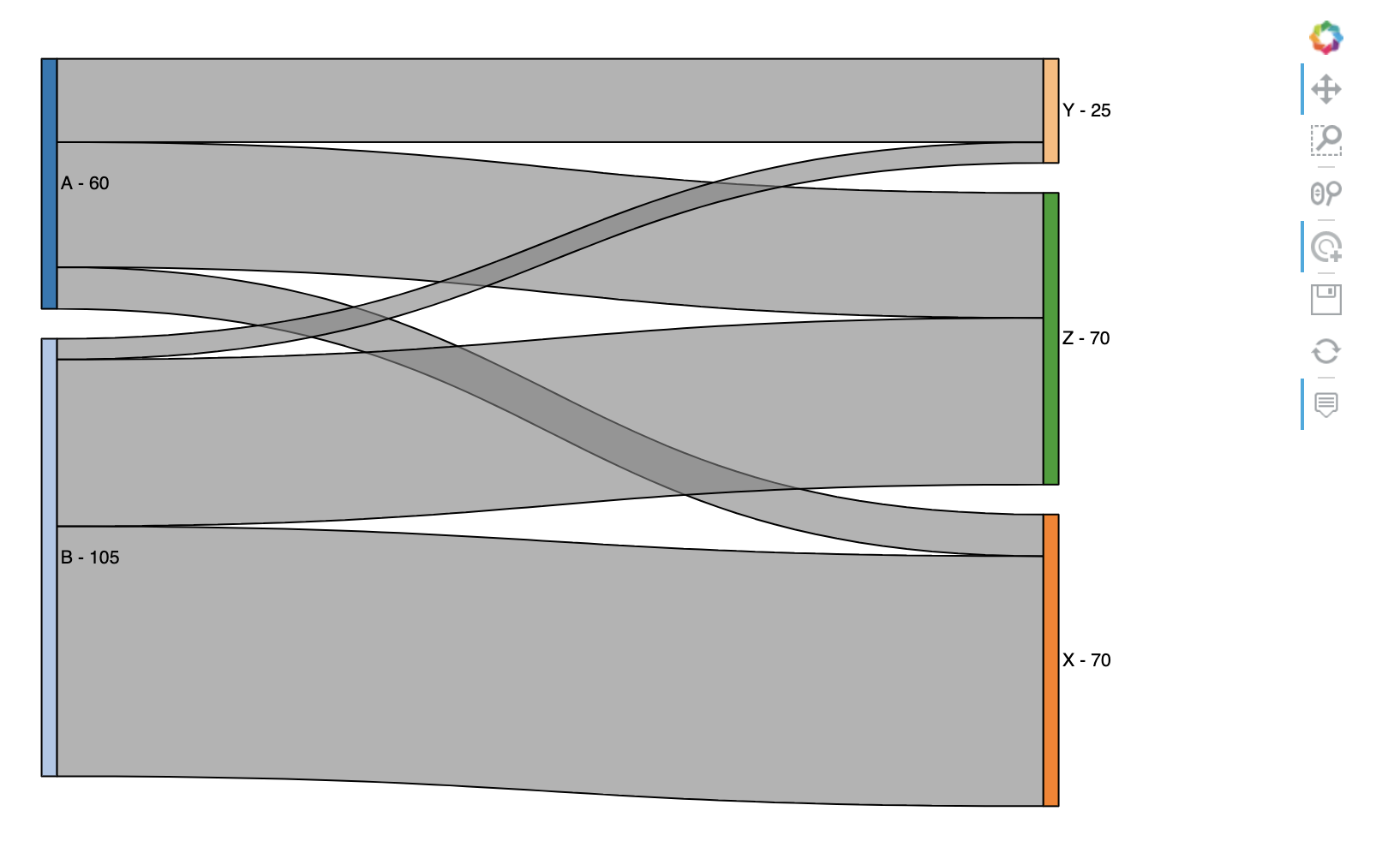
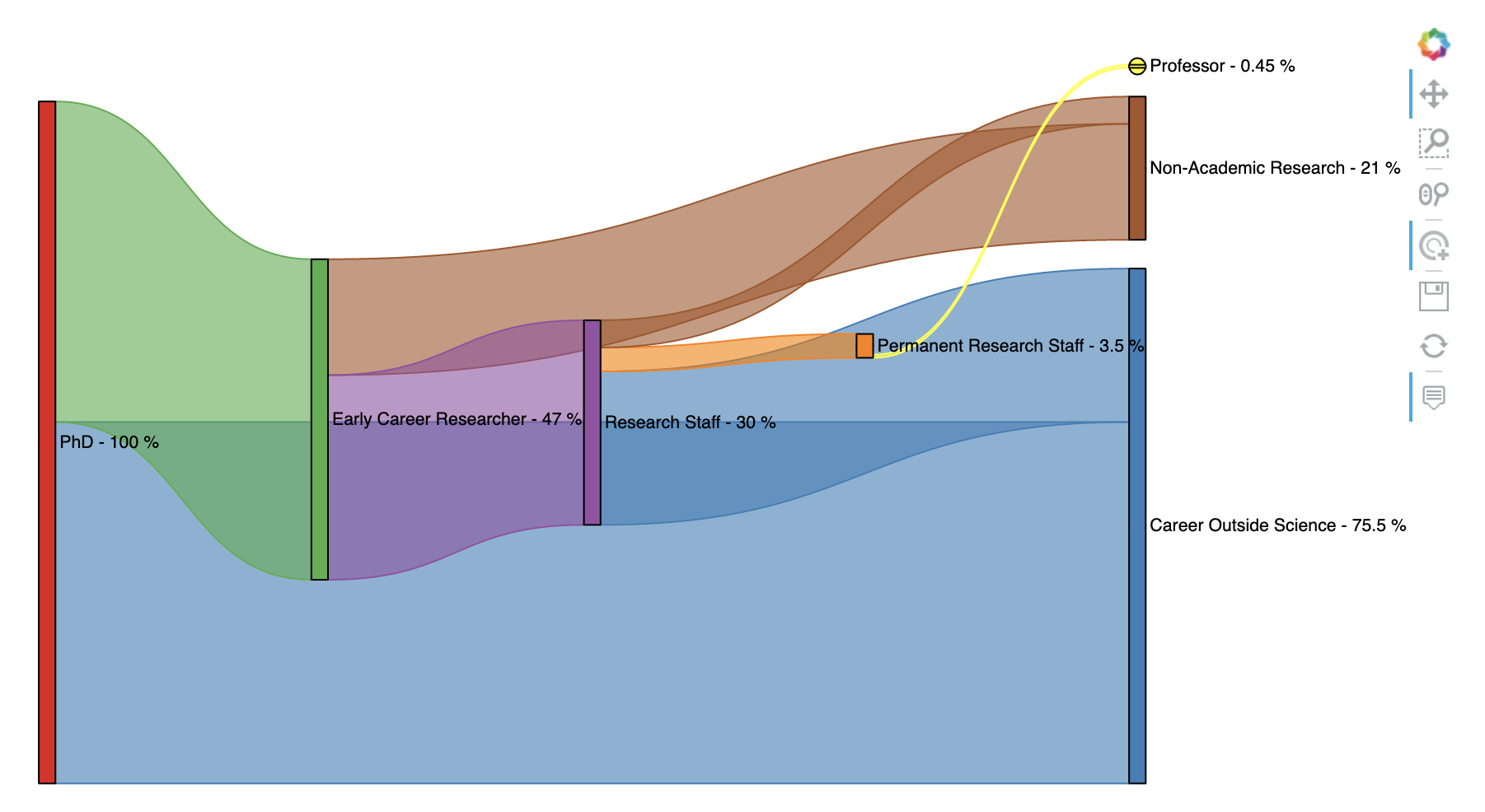
아래의 예시는 2010년 왕립학회 정책 보고서 "The Scientific Century: securing our future prosperity"에 설명된 영국 박사과정 학생들의 진로에 대한 간단한 데이터 세트를 Sankey Diagram으로 그려본 것입니다. 우리는 정수 지수로 열거된 노드와 각 경력 단계 사이에 흐르는 백분율을 정의합니다. 마지막으로 "To"라는 레이블을 붙이는 대상 노드에 의해 값과 색상에 대한 단위를 가진 차원을 정의합니다. [2]
위의 예에서는 nodes의 이름을 그대로 사용하였다면, 아래의 예에서는 nodes에 대해서 enumerate() 함수를 사용해서 index 정수를 매핑해서 holoveiws Dataset 객체로 만들어 주고, 이를 edges 의 관계를 정의할 때 index 정수를 사용하였습니다.
nodes = ["PhD", "Career Outside Science",  "Early Career Researcher", "Research Staff",
         "Permanent Research Staff",  "Professor",  "Non-Academic Research"]
for i, j in enumerate(nodes):
    print(i, ':', j)

# 0 : PhD
# 1 : Career Outside Science
# 2 : Early Career Researcher
# 3 : Research Staff
# 4 : Permanent Research Staff
# 5 : Professor
# 6 : Non-Academic Research
Label의 위치를 오른쪽으로 바꾸어 주었으며 (label_position='right'), cmap, edge_color, node_color 로 edge와 node 의 색깔도 다르게 설정해주었습니다. 색깔이 다르니 가독성이 한결 좋아졌습니다.
## the edges are expressed as integer node indexes and labels are provided separately.
## We can explicitly define the set of nodes as a Dataset of indexes and labels as key
## and value dimensions respectively.
nodes = ["PhD", "Career Outside Science",  "Early Career Researcher", "Research Staff",
         "Permanent Research Staff",  "Professor",  "Non-Academic Research"]
nodes = hv.Dataset(enumerate(nodes), 'index', 'label')

edges = [
    (0, 1, 53),
    (0, 2, 47),
    (2, 6, 17),
    (2, 3, 30),
    (3, 1, 22.5),
    (3, 4, 3.5),
    (3, 6, 4.),
    (4, 5, 0.45)
]

value_dim = hv.Dimension('Percentage', unit='%')
careers = hv.Sankey((edges, nodes), ['From', 'To'], vdims=value_dim)

careers.opts(
    opts.Sankey(labels='label',
                label_position='right', # adjust the label_position from "right" to "left"
                width=900, height=500,
                cmap='Set1',
                edge_color=dim('To').str(), # setting edge color
                node_color=dim('index').str()) # setting node color
)
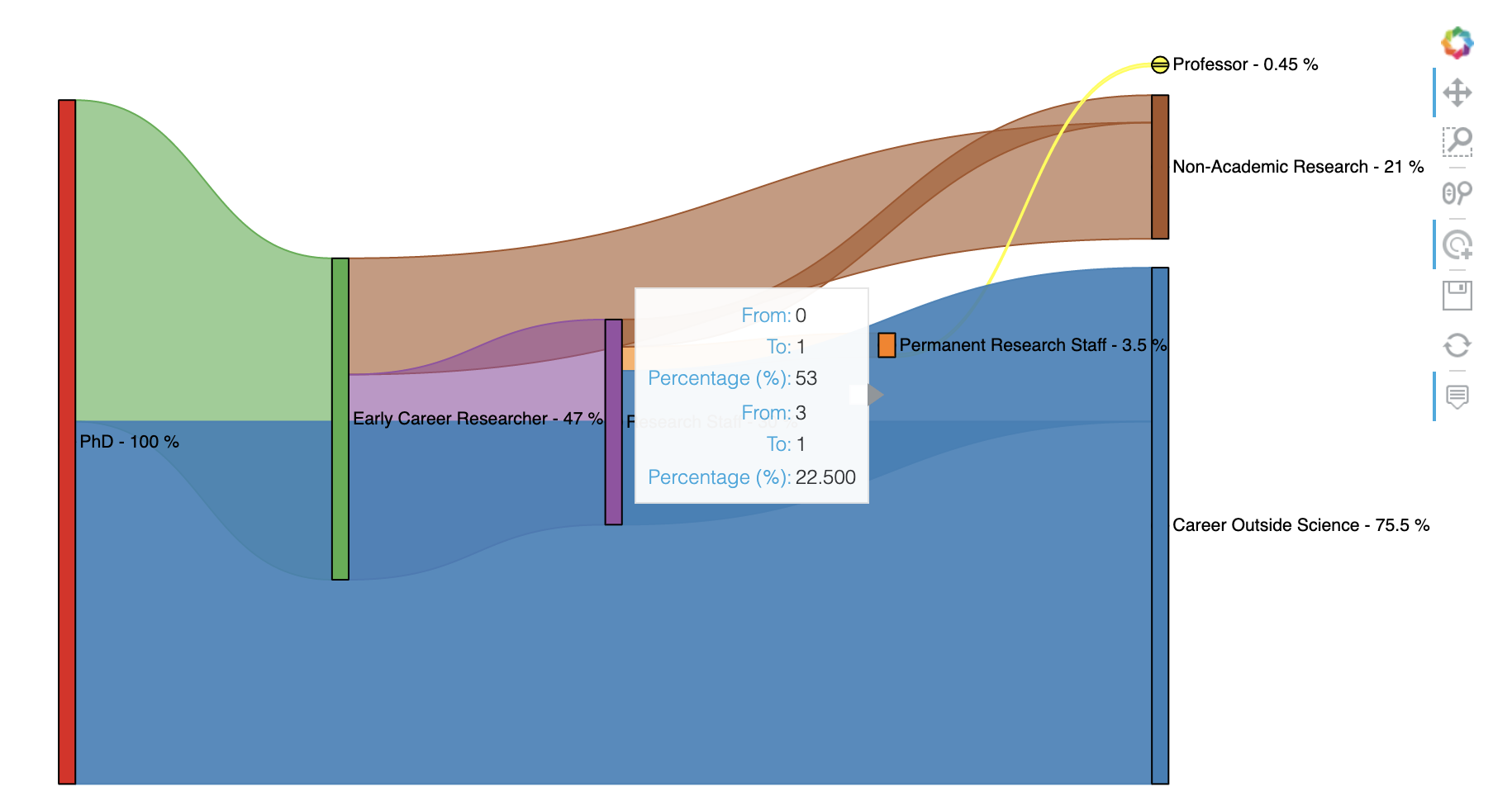
Interactive Diagram 이어서 커서를 가져다대면 아래의 화면 캡쳐와 같이 해당 Edge 가 하이라이드 되며 해당 Edge의 From note, To note, Percentage 등의 캡션 정보를 팝업으로 볼 수 있습니다. (아래는 화면 캡쳐이므로 Interactive 기능 없음. Jupyter Notebook에서 실행해야지 Interactive 기능 사용 가능함)
[ Reference ]
[1] Introduction to Sankey Diagram: https://en.wikipedia.org/wiki/Sankey_diagram
[2] Sankey Element using HoloViews: https://holoviews.org/reference/elements/bokeh/Sankey.html
[3] R로 Sankey Diagram 시각화 하기: https://rfriend.tistory.com/220
이번 포스팅이 많은 도움이 되었기를 바랍니다.
행복한 데이터 과학자 되세요! :-)

'Python 분석과 프로그래밍 > Python 그래프_시각화' 카테고리의 다른 글
| [Python matplotlib] 그래프에 도형 추가하기 (adding shapes, artists in matplotlib's plot) (0) | 2022.02.02 |
|---|---|
| [Python matplotlib] 버블 그래프 (Bubble chart) (2) | 2022.02.01 |
| [Python matplotlib] numpy 2D array의 행 기준, 열 기준 백분율을 구해서 히트맵 그리기 (0) | 2022.01.16 |
| [Python matplotlib] 그래프 X축의 범주형 항목 순서 변경하기 (changing the order of x-axis xticks) (0) | 2022.01.06 |
| [Python matplotlib] 범례 추가하기 (adding a legend) (0) | 2021.11.27 |


