이번 포스팅에서는 R Shiny를 사용하여 interactive하게 편하고 쉽게 두 연속형 변수 간 관계를 알아볼 수 있도록 

(1) 상관계수 (Correlation Coefficient)를 구하고, 

(2) 산점도 (Scatter Plot)을 그린 후, 

(3) 선형 회귀선 (Linear Regression Line) 을 겹쳐서 그려주는 

웹 애플리케이션을 만들어보겠습니다. 


R Shiny - Correlation Coefficient, Scatter Plot, Linear Regression Line


예제로 사용할 데이터는 MASS 패키지에 내장되어 있는 Cars93 데이터프레임으로서, Price, MPG.city, MPG.highway, EngineSize, Horsepower, RPM 의 6개 연속형 변수를 선별하였습니다. 


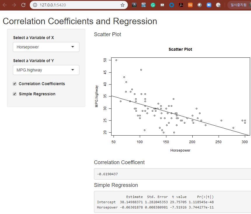
왼쪽 사이드바 패널에는 산점도의 X축, Y축에 해당하는 연속형 변수를 콤보박스로 선택할 수 있도록 하였으며, 상관계수와 선형회귀모형을 적합할 지 여부를 선택할 수 있는 체크박스도 추가하였습니다. 


오른쪽 본문의 메인 패널에는 두 연속형 변수에 대한 산점도 그래프에 선형 회귀선을 겹쳐서 그려서 보여주고, 상관계수와 선형회귀 적합 결과를 텍스트로 볼 수 있도록 화면을 구성하였습니다. 


library(shiny)

# Define UI for application that analyze correlation coefficients and regression

ui <- fluidPage(


   # Application title

   titlePanel("Correlation Coefficients and Regression"),


   # Select 2 Variables, X and Y 

   sidebarPanel(

     selectInput("var_x", 

                 label = "Select a Variable of X", 

                 choices = list("Price"="Price", 

                                "MPG.city"="MPG.city", 

                                "MPG.highway"="MPG.highway", 

                                "EngineSize"="EngineSize", 

                                "Horsepower"="Horsepower", 

                                "RPM"="RPM"), 

                 selected = "RPM"),


     selectInput("var_y", 

                 label = "Select a Variable of Y", 

                 choices = list("Price"="Price", 

                                "MPG.city"="MPG.city", 

                                "MPG.highway"="MPG.highway", 

                                "EngineSize"="EngineSize", 

                                "Horsepower"="Horsepower", 

                                "RPM"="RPM"), 

                 selected = "MPG.highway"), 


     checkboxInput(inputId = "corr_checked", 

                   label = strong("Correlation Coefficients"), 

                   value = TRUE), 


     checkboxInput(inputId = "reg_checked", 

                   label = strong("Simple Regression"), 

                   value = TRUE)

      ),

      # Show a plot of the generated distribution

      mainPanel(

        h4("Scatter Plot"), 

        plotOutput("scatterPlot"), 


        h4("Correlation Coefficent"), 

        verbatimTextOutput("corr_coef"), 


        h4("Simple Regression"), 

        verbatimTextOutput("reg_fit")

      )

   )

# Define server logic required to analyze correlation coefficients and regression

server <- function(input, output) {

  library(MASS)

  scatter <- Cars93[,c("Price", "MPG.city", "MPG.highway", "EngineSize", "Horsepower", "RPM")]


  # scatter plot

  output$scatterPlot <- renderPlot({

    var_name_x <- as.character(input$var_x)

    var_name_y <- as.character(input$var_y)


    plot(scatter[, input$var_x],

         scatter[, input$var_y],

         xlab = var_name_x,

         ylab = var_name_y,

         main = "Scatter Plot")


    # add linear regression line

    fit <- lm(scatter[, input$var_y] ~ scatter[, input$var_x])

    abline(fit)

    })


  # correlation coefficient

  output$corr_coef <- renderText({

    if(input$corr_checked){

      cor(scatter[, input$var_x], 

          scatter[, input$var_y])

      }

    })


  # simple regression

  output$reg_fit <- renderPrint({

    if(input$reg_checked){

      fit <- lm(scatter[, input$var_y] ~ scatter[, input$var_x])

      names(fit$coefficients) <- c("Intercept", input$var_x)

      summary(fit)$coefficients

    }

  })

}

# Run the application 

shinyApp(ui = ui, server = server)


많은 도움이 되었기를 바랍니다. 


728x90
반응형
Posted by Rfriend
,

이번 포스팅은 두 개의 연속형 변수에 대한 관계를 파악하는데 유용하게 사용할 수 있는 산점도(Scatter Plot) 의 두번째 포스팅으로서 그룹별로 산점도의 점의 색깔과 모양을 다르게 하는 방법을 소개합니다. 


(1) 산점도 (Scatter Plot)

(2) 그룹별 산점도 (Scatter Plot by Groups)

(3) 산점도의 marker 크기 및 색깔, 모양 설정 (Setting Marker's size, color, shape)

(4) 산점도 행렬 (Scatter Plot Matrix)


산점도를 그리는데 사용할 데이터는 iris 로서, 'petal length'와 'petal width'의 연속형 변수에 대해서 'species' 그룹별로 점의 색깔과 모양을 다르게 설정해보겠습니다. 


참고로 species 에는 setosa 50개, versicolor 50개, virginica 50개씩의 관측치가 들어있습니다. 


# importing libraries

import numpy as np

import pandas as pd


import matplotlib.pyplot as plt

import seaborn as sns

plt.rcParams['figure.figsize'] = [10, 8] # setting figure size


# loading 'iris' dataset from seaborn

iris = sns.load_dataset('iris')

iris.shape

(150, 5)


iris.head()

  sepal_length sepal_width petal_length petal_width species
0 5.1 3.5 1.4 0.2 setosa
1 4.9 3.0 1.4 0.2 setosa
2 4.7 3.2 1.3 0.2 setosa
3 4.6 3.1 1.5 0.2 setosa
4 5.0 3.6 1.4 0.2 setosa


iris.groupby('species').size()

species setosa 50 versicolor 50 virginica 50 dtype: int64


  (1) matplotlib 으로 그룹별 산점도 그리기 (scatter plot by groups via matplotlib)


# Scatter plot with a different color by groups

groups = iris.groupby('species')


fig, ax = plt.subplots()

for name, group in groups:

    ax.plot(group.petal_length, 

            group.petal_width, 

            marker='o', 

            linestyle='',

            label=name)

ax.legend(fontsize=12, loc='upper left') # legend position

plt.title('Scatter Plot of iris by matplotlib', fontsize=20)

plt.xlabel('Petal Length', fontsize=14)

plt.ylabel('Petal Width', fontsize=14)

plt.show()


  (2) seaborn 으로 그룹별 산점도 그리기 (scatter plot by groups via seaborn)


코드가 깔끔하고 가독성이 좋으며, 산점도 그래프도 보기에 참 좋습니다. 


# Scatter plot by Groups

sns.scatterplot(x='petal_length', 

                y='petal_width', 

                hue='species', # different colors by group

                style='species', # different shapes by group

                s=100, # marker size

                data=iris)

plt.show()


혹시 AttributeError: module 'seaborn' has no attribute 'scatterplot' 에러가 나면 seaborn version upgrade를 해주시기 바랍니다. 


# error: AttributeError: module 'seaborn' has no attribute 'scatterplot' 

# solution: upgrade seaborn

pip install --upgrade seaborn


  (3) pandas로 그룹별 산점도 그리기 (scatter plot by groups via pandas)


# adding 'color' column

iris['color'] = np.where(iris.species == 'setosa', 'red', 

                         np.where(iris.species =='versicolor', 

                         'green', 

                         'blue'))


# scatter plot

iris.plot(kind='scatter',

          x='petal_length', 

          y='petal_width', 

          s=50, # marker size

          c=iris['color']) # marker color by group


plt.title('Scatter Plot of iris by pandas', fontsize=20)

plt.xlabel('Petal Length', fontsize=14)

plt.ylabel('Petal Width', fontsize=14)

plt.show()


많은 도움이 되었기를 바랍니다. 

이번 포스팅이 도움이 되었다면 아래의 '공감~

'를 꾹 눌러주세요. ^^


다음번 포스팅에서는 산점도의 marker 크기 및 색깔, 모양 설정 (Setting Marker's size, color, shape) 에 대해서 소개하겠습니다. 


728x90
반응형
Posted by Rfriend
,

이번 포스팅부터는 두 개의 연속형 변수에 대한 관계를 파악하는데 유용하게 사용할 수 있는 산점도(Scatter Plot) 를 4번에 나누어서 소개를 하겠습니다. 


(1) 산점도 (Scatter Plot)

(2) 그룹별 산점도 (Scatter Plot by Groups)

(3) 산점도의 marker 크기 및 색깔, 모양 설정 (Setting Marker's size, color, shape)

(4) 산점도 행렬 (Scatter Plot Matrix)


기본적인 산점도를 matplotlib, seaborn, pandas 패키지를 사용하여 순서대로 그려보겠습니다. 


사용할 데이터는 iris 데이터셋의 'petal length'와 'petal width'의 두 개 연속형 변수입니다. 


# importing libraries

import numpy as np

import pandas as pd


import matplotlib.pyplot as plt

import seaborn as sns

plt.rcParams['figure.figsize'] = [12, 8] # setting figure size


# loading 'iris' dataset from seaborn

iris = sns.load_dataset('iris')

iris.shape

(150, 5) 


iris.head()

  sepal_length sepal_width petal_length petal_width species
0 5.1 3.5 1.4 0.2 setosa
1 4.9 3.0 1.4 0.2 setosa
2 4.7 3.2 1.3 0.2 setosa
3 4.6 3.1 1.5 0.2 setosa
4 5.0 3.6 1.4 0.2 setosa


  (1) matplotlib을 사용한 산점도 (scatter plot by matplotlib)


# Basic Scatter Plot

plt.plot('petal_length',  # x

         'petal_width',  # y

         data=iris, 

         linestyle='none', 

         marker='o', 

         markersize=10,

         color='blue', 

         alpha=0.5)

plt.title('Scatter Plot of iris by matplotlib', fontsize=20)

plt.xlabel('Petal Length', fontsize=14)

plt.ylabel('Petal Width', fontsize=14)

plt.show()


산점도에 X, Y 좌표를 사용하여 직사각형(rectangle), 원(circle), 직선(line)을 추가하여 보겠습니다. 먼저 matplotlib.patches 를 importing 해주어야 하고, 산점도를 그린 다음에, add_patch() 함수를 사용하여 직사각형, 원, 직선을 추가합니다. 


# adding a rectangle, a circle

import matplotlib.patches as patches

import matplotlib.pyplot as plt


fig1 = plt.figure()

ax1 = fig1.add_subplot(111)


# (0) scatter plot

ax1.plot('petal_length', 'petal_width', data=iris, linestyle='none', marker='o')


# (1) adding a rectangle

ax1.add_patch(

    patches.Rectangle(

        (3, 1), # (x, y)

        2, # width

        1, # height

        alpha=0.2, 

        facecolor="blue", 

        edgecolor="black", 

        linewidth=2, 

        linestyle="solid", 

        angle=-10))


# (2) adding a circle

ax1.add_patch(

    patches.Circle(

        (1.5, 0.25), # (x, y)

        0.5, # radius

        alpha=0.2, 

        facecolor="red", 

        edgecolor="black", 

        linewidth=2, 

        linestyle='solid'))


# (3) adding a line

plt.plot([4, 6], [2.2, 1.1], color="green", lw=4, linestyle='solid')


plt.title("Adding a Rectangle, a Circle and a Line", fontsize=20)

plt.xlabel('Petal Length', fontsize=14)

plt.ylabel('Petal Width', fontsize=14)

plt.show()


  (2) seaborn을 사용한 산점도 (scatter plot by seaborn)


seaborn 패키지의 (a) regplot() 함수와 (b) scatterplot() 함수를 사용해서 산점도를 그릴 수 있습니다. 순서대로 소개합니다. 


(a) regplot() 함수를 사용한 산점도


선형회귀 적합 선을 포함시키지 않으려면 fit_reg=False 를 설정해주면 됩니다. 


# Basic Scatter Plot by seaborn

sns.regplot(x=iris['petal_length'], 

           y=iris['petal_width'], 

           fit_reg=False) # no regression line

plt.title('Scatter Plot of iris by regplot()', fontsize=20)

plt.xlabel('Petal Length', fontsize=14)

plt.ylabel('Petal Width', fontsize=14)

plt.show()


두 연속형 변수 간의 선형회귀 적합선을 산점도에 포함시키려면 fit_reg=True 를 설정해주면 됩니다. (defalt 이므로 별도로 표기를 해주지 않아도 회귀적합선이 추가됩니다)


# Scatter Plot with regression line by seaborn regplot()

sns.regplot(x=iris['petal_length'], 

           y=iris['petal_width'], 

           fit_reg=True) # default

plt.title('Scatter Plot with Regression Line by regplot()', fontsize=20)

plt.show()


X축과 Y축의 특정 값의 조건을 기준으로 산점도 marker의 색깔을 다르게 해보겠습니다. 가령, 'petal length' > 2.5 & 'petal width' > 0.8 이면 '빨간색', 그 이외는 '파란색'으로 설정을 해보겠습니다. 조건에 맞게 'color'라는 새로운 변수를 생성한 후에, scatter_kws={'facecolors': iris_df['color']}) 로 조건별 색을 설정하는 방법을 사용하였습니다. 


# Control color of each marker based on X and Y values

iris_df = iris.copy()


# Adding a 'color' column based on x and y values

cutoff = (iris_df['petal_length']>2.5) & (iris_df['petal_width'] > 0.8)

iris_df['color'] = np.where(cutoff==True, "red", "blue")


# Scatter Plot with different colors based on X and Y values

sns.regplot(x=iris['petal_length'], 

           y=iris['petal_width'], 

           fit_reg=False

           scatter_kws={'facecolors': iris_df['color']}) # marker color

plt.title('Scatter Plot with different colors by X & Y values', fontsize=20)

plt.show()


(b) scatterplot() 함수를 사용한 산점도


# scatter plot by seaborn scatterplot()

ax = sns.scatterplot(x='petal_length', 

                     y='petal_width', 

                     alpha=0.5,

                     data=iris)

plt.title('Scatter Plot by seaborn', fontsize=20)

plt.show()


  (3) pandas를 사용한 산점도 (scatter plot by pandas)


iris.plot.scatter(x='petal_length', 

                  y='petal_width', 

                  s=50, # marker size

                  c='blue', 

                  alpha=0.5)

plt.title('Scatter Plot of iris by pandas', fontsize=20)

plt.xlabel('Petal Length', fontsize=14)

plt.ylabel('Petal Width', fontsize=14)

plt.show()


많은 도움이 되었기를 바랍니다. 


이번 포스팅이 도움이 되었다면 아래의 '공감~

'를 꾹 눌러주세요. ^^


다음번 포스팅에서는 그룹별 산점도 (Scatter Plot by Groups) 의 마커 모양, 색깔을 다르게 그리는 방법을 소개하겠습니다. 


728x90
반응형
Posted by Rfriend
,

변수의 개수 및 데이터의 형태에 따라서 그래프, 시각화 방법이 달라지는데요,


지난번 포스팅에서는 한 변수의 연속형 데이터의 시각화 방법으로


 - 히스토그램(Histogram)
    : geom_histogram()

- 커널 밀도 곡선(Kernel Density Curve)
    : geom_density()

 - 박스 그래프(Box Plot)
    : geom_boxplot()

 - 바이올린 그래프(Violin Plot)
    : geom_violin()


범주형 데이터에 대한 시각화 방법으로


 - 막대그림(Bar Chart): geom_bar()

 - 원그림(Pie Chart): geom_bar() + coord_polar()

 - 모자이크 그림(Mosaic Chart): vcd 패키지 mosaic()


알아보았습니다.


이번에는 두 개 이상의 연속형 변수를 시각화하는 방법으로


 - 산점도 (Scatter Plot): geom_point()

 - 선 그래프(Line Plot): geom_line()

 - 시계열 그래프(Time Series Plot): geom_line()  


에 대해서 알아보겠습니다.


참고로 ☞ ggplot2의 geom_point() 산점도 그리기 

          ☞ Base Graphics 패키지의 pairs() 함수를 사용한 산점도 행렬 그리기


[ 변수 개수 및 형태에 따른 그래프 종류 ]


산점도(Scatter Plot)는 x축과 y축에 연속형인 두 변수의 값을 점으로 뿌려준 그래프로서, 연속형인 두 변수 간의 관계를 파악하는데 유용합니다.  다중회귀분석을 할 때 제일 처음 하는 일이 바로 산점도 (행렬)을 그려보고 두 변수간의 선형성 여부를 탐색해보는 일입니다.


MASS패키지 내 Cars93 데이터 프레임의 고속도로연비(MPG.highway)와 엔진크기(EngineSize), 무게(Weight), 길이(Length) 와의 관계를 ggplot2 패키지의 geom_point() 함수를 가지고 산포도를 그려서 알아보도록 하겠습니다.   그리고 차종(Type)별로 고속도로연비(MPG.highway) 는 어떻게 되는지도 산포도를 가지고 점의 색깔과 모양을 달리해서 보는 방법을 알아보겠습니다.


> library(MASS)
> str(Cars93)
'data.frame':	93 obs. of  27 variables:
 $ Manufacturer      : Factor w/ 32 levels "Acura","Audi",..: 1 1 2 2 3 4 4 4 4 5 ...
 $ Model             : Factor w/ 93 levels "100","190E","240",..: 49 56 9 1 6 24 54 74 73 35 ...
 $ Type              : Factor w/ 6 levels "Compact","Large",..: 4 3 1 3 3 3 2 2 3 2 ...
 $ Min.Price         : num  12.9 29.2 25.9 30.8 23.7 14.2 19.9 22.6 26.3 33 ...
 $ Price             : num  15.9 33.9 29.1 37.7 30 15.7 20.8 23.7 26.3 34.7 ...
 $ Max.Price         : num  18.8 38.7 32.3 44.6 36.2 17.3 21.7 24.9 26.3 36.3 ...
 $ MPG.city          : int  25 18 20 19 22 22 19 16 19 16 ...
 $ MPG.highway       : int  31 25 26 26 30 31 28 25 27 25 ...
 $ AirBags           : Factor w/ 3 levels "Driver & Passenger",..: 3 1 2 1 2 2 2 2 2 2 ...
 $ DriveTrain        : Factor w/ 3 levels "4WD","Front",..: 2 2 2 2 3 2 2 3 2 2 ...
 $ Cylinders         : Factor w/ 6 levels "3","4","5","6",..: 2 4 4 4 2 2 4 4 4 5 ...
 $ EngineSize        : num  1.8 3.2 2.8 2.8 3.5 2.2 3.8 5.7 3.8 4.9 ...
 $ Horsepower        : int  140 200 172 172 208 110 170 180 170 200 ...
 $ RPM               : int  6300 5500 5500 5500 5700 5200 4800 4000 4800 4100 ...
 $ Rev.per.mile      : int  2890 2335 2280 2535 2545 2565 1570 1320 1690 1510 ...
 $ Man.trans.avail   : Factor w/ 2 levels "No","Yes": 2 2 2 2 2 1 1 1 1 1 ...
 $ Fuel.tank.capacity: num  13.2 18 16.9 21.1 21.1 16.4 18 23 18.8 18 ...
 $ Passengers        : int  5 5 5 6 4 6 6 6 5 6 ...
 $ Length            : int  177 195 180 193 186 189 200 216 198 206 ...
 $ Wheelbase         : int  102 115 102 106 109 105 111 116 108 114 ...
 $ Width             : int  68 71 67 70 69 69 74 78 73 73 ...
 $ Turn.circle       : int  37 38 37 37 39 41 42 45 41 43 ...
 $ Rear.seat.room    : num  26.5 30 28 31 27 28 30.5 30.5 26.5 35 ...
 $ Luggage.room      : int  11 15 14 17 13 16 17 21 14 18 ...
 $ Weight            : int  2705 3560 3375 3405 3640 2880 3470 4105 3495 3620 ...
 $ Origin            : Factor w/ 2 levels "USA","non-USA": 2 2 2 2 2 1 1 1 1 1 ...
 $ Make              : Factor w/ 93 levels "Acura Integra",..: 1 2 4 3 5 6 7 9 8 10 ...


상관계수를 가지고 고속도로연비(MPG.highway)와 엔진크기(EngineSize), 무게(Weight), 길이(Length) 와의 상관도를 먼저 살펴보면, 고속도로연비와 엔진크기, 무게, 길이가 모두 역의 상관관계가 있는 걸로 나왔고, 특히 무게가 역의 상관관계가 크게 나왔습니다.  


> Cars93_MPG <- Cars93[,c("MPG.highway", "EngineSize", "Weight", "Length")]
> cor(Cars93_MPG)
            MPG.highway EngineSize     Weight     Length
MPG.highway   1.0000000 -0.6267946 -0.8106581 -0.5428974
EngineSize   -0.6267946  1.0000000  0.8450753  0.7802831
Weight       -0.8106581  0.8450753  1.0000000  0.8062743
Length       -0.5428974  0.7802831  0.8062743  1.0000000 


이제 산점도를 그려서 고속도로연비(MPG.highway)와 엔진크기(EngineSize), 무게(Weight), 길이(Length) 관계를 살펴보겠습니다.


제일 쉬운 방법은 Base graphics 패키지에 있는 plot()함수를 사용하는 방법입니다.  위에서 분석하려는 변수만 따로 선별해놓은 Cars93_MPG 데이터 프레임을 가지고 한번 산점도 행렬을 그려보겠습니다.


> plot(Cars93_MPG, 
+      main="Scatter Plot Matrix")


ggplot2로는 산점도 행렬(Scatter Plot matrix)를 그리는 것이 힘듭니다.  대신 여러 조건을 주어서 두 변수 간 산점도 행렬을 다양하게 그려보는데는 아주 강력합니다   우선 ggplot2의 geom_point()함수를 가지고 색깔(colour)과 모양(shape)을 달리하면서 산점도를 그려보겠습니다.


> # Scatter Plot: MPG.highway vs. EngineSize, Weight, Length
> library(ggplot2)
> 
> ggplot(data=Cars93, aes(x=EngineSize, y=MPG.highway)) + 
+   geom_point(shape=15, size=3, colour="blue") + # shape 15: solid square
+   ggtitle("Scatter Plot: MPG.highway vs. EngineSize")


> ggplot(data=Cars93, aes(x=Weight, y=MPG.highway)) + 
+   geom_point(shape=19, size=3, colour="red") + # shape 19: solid circle
+   ggtitle("Scatter Plot: MPG.highway vs. Weight")


> ggplot(data=Cars93, aes(x=Length, y=MPG.highway)) + 
+   geom_point(shape=24, size=3, colour="black") + # shape 24: filled triangle point-up
+   ggtitle("Scatter Plot: MPG.highway vs. Length")


참고로, R plot의 숫자별 모양은 다음과 같습니다.


> # R plot symbols: points
> help(pch)


이번에는 두 변수의 산포도에 모델명 라벨을 geom_text(label=) 함수를 이용하여 입혀보겠습니다.  


> # Scatter Plot with Label (Model Name) > ggplot(data=Cars93, aes(x=Weight, y=MPG.highway)) + + geom_point(shape=19, size=3, colour="red") + # shape 19: solid circle + ggtitle("Scatter Plot: MPG.highway vs. Weight with Model Label") + + geom_text(aes(label=Model, size=2, vjust=-1, hjust=0)) # vjust=-1 위로, hjust=1 오른쪽


다음으로 차종(Type)별로 구분하여서 무게(Weight)와 고속도로연비(MPG.highway) 간의 관계를 3가지 방법을 사용하여 산포도로 그려보도록 하겠습니다.


     (1) 차종(Type)별로 색깔(colour)을 달리해서

     (2) 차종(Type)별로 모양(shape)을 달리해서

     (3) 차종(Type)별로 층(facet_grid)을 나누어서

산포도를 그려보겠습니다.


(1) 차종(Type)별로 색깔(colour)을 달리했을 때 


> # Scatter Plot by Type, using different Colours
> ggplot(data=Cars93, aes(x=Weight, y=MPG.highway, colour=Type)) + 
+   geom_point(shape=19, size=3) + 
+   ggtitle("Scatter Plot by Type, using different Colours")


 (2) 차종(Type)별로 모양(shape)을 달리했을 때


> # Scatter Plot by Type, differenct Shapes
> ggplot(data=Cars93, aes(x=Weight, y=MPG.highway, shape=Type)) + 
+   geom_point(size=3) + 
+   ggtitle("Scatter Plot by Type, differenct Shapes")


(3) 차종(Type)별로 층(facet_grid)을 나누어서 산포도를 그릴 때 


> # Scatter Plot by Type, using facet_grid
> ggplot(data=Cars93, aes(x=Weight, y=MPG.highway)) + 
+   geom_point(size=3, shape=19) + 
+   facet_grid(Type ~.) +
+   ggtitle("Scatter Plot by Type, using facet_grid")


다음으로, 산포도에 선형 회귀선 (신뢰구간 95%)을 적합시켜보겠습니다.


> # Scatter Plot with linear regression line
> ggplot(data=Cars93, aes(x=Weight, y=MPG.highway)) + 
+   geom_point(shape=19, size=3, colour="red") + # shape 19: solid circle 
+   stat_smooth(method=lm, level=0.95) + 
+   ggtitle("Scatter Plot: Linear Regression Line with Confidence Level 95%")


아래는 산포도에 회귀선을 적합시켰는데, 위와는 다르게 신뢰구간은 뺀 경우입니다.


> ggplot(data=Cars93, aes(x=Weight, y=MPG.highway)) + 
+   geom_point(shape=19, size=3, colour="red") + # shape 19: solid circle 
+   stat_smooth(method=lm, se=FALSE) + 
+   ggtitle("Scatter Plot: Linear Regression Line without Confidence Level")


산포도에 선을 적합시킬 때 선형회귀선말고도 loess(locally weighted polynomial) 를 써서 비모수 회귀(Nonparametric regression) 선을 적합시킬 수도 있습니다.


> # Scatter Plot with loess(locally weighted polynomial)
> ggplot(data=Cars93, aes(x=Weight, y=MPG.highway)) + 
+   geom_point(shape=19, size=3, colour="red") + # shape 19: solid circle 
+   stat_smooth(method=loess, level=0.95) + 
+   ggtitle("Scatter Plot: loess Line with Confidence Level 95%")


많은 도움 되었기를 바랍니다.


이번 포스팅이 도움이 되었다면 아래의 '공감 ~♡' 단추를 꾸욱 눌러주세요.^^


728x90
반응형
Posted by Rfriend
,