이번 포스팅에서는 Python matplotlib 모듈을 사용해서 그래프를 그렸을 때 범례를 추가(adding a legend on the Axes)하는 4가지 방법을 소개하겠습니다. 그리고 범례의 위치, 범례 글자 크기, 범례 배경색, 범례 테두리 색, 범례 그림자 등을 설정하는 방법을 소개하겠습니다.
matplotlib 으로 그래프를 그린 후 범례를 추가하는 방법에는 (1-1) legend(), (1-2) line.set_label(), (1-3) legend(handles, labels), (1-4) legend(handles=handles) 의 4가지 방법이 있습니다. 이중에서 그래프를 그릴 때 label 을 입력해주고, 이어서 ax.legend() 나 plt.legend() 를 실행해서 자동으로 범례를 만드는 방법이 가장 쉽습니다. 차례대로 4가지 방법을 소개하겠습니다. 결과는 모두 동일하므로 범례가 추가된 그래프는 (1-1)번에만 소개합니다.
먼저, 아래의 2개 방법은 자동으로 범례를 탐지해서 범례를 생성해주는 예제입니다.
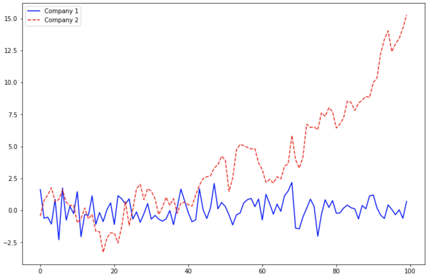
(1-1) ax.plot(label='text...') --> ax.legend() 또는 plt.legend()
import numpy as np
import matplotlib.pyplot as plt

np.random.seed(1)
x = np.arange(100)
y1 = np.random.normal(0, 1, 100)
y2 = np.random.normal(0, 1, 100).cumsum()

## 1. Automatic detection of elements to be shown in the legend
## 1-1. label
fig = plt.figure(figsize=(12, 8))
ax = fig.add_subplot(1, 1, 1)

## labels: A list of labels to show next to the artists.
ax.plot(x, y1, 'b-', label='Company 1')
ax.plot(x, y2, 'r--', label='Company 2')
ax.legend()
plt.show()
위의 두 방법은 범례를 자동 탐지해서 생성해줬다면, 아래의 방법부터는 명시적으로 범례의 handles (선 모양과 색깔 등) 와 labels (범례 이름)를 지정해줍니다.
(1-3) ax.legend(handles, labels)
## 2. Explicitly listing the artists and labels in the legend
## to pass an iterable of legend artists followed by an iterable of legend labels respectively
fig = plt.figure(figsize=(12, 8))
ax = fig.add_subplot(1, 1, 1)

line1, = ax.plot(x, y1, 'b-')
line2, = ax.plot(x, y2, 'r--')

ax.legend([line1, line2], ['Company 1', 'Company 2'])
plt.show()
(1-4) ax.legend(handles=handles)
## 3. Explicitly listing the artists in the legend
## the labels are taken from the artists' label properties.
fig = plt.figure(figsize=(12, 8))
ax = fig.add_subplot(1, 1, 1)

line1, = ax.plot(x, y1, 'b-', label='Company 1')
line2, = ax.plot(x, y2, 'r--', label='Company 2')

## handles: A list of Artists (lines, patches) to be added to the legend.
ax.legend(handles=[line1, line2])
plt.show()
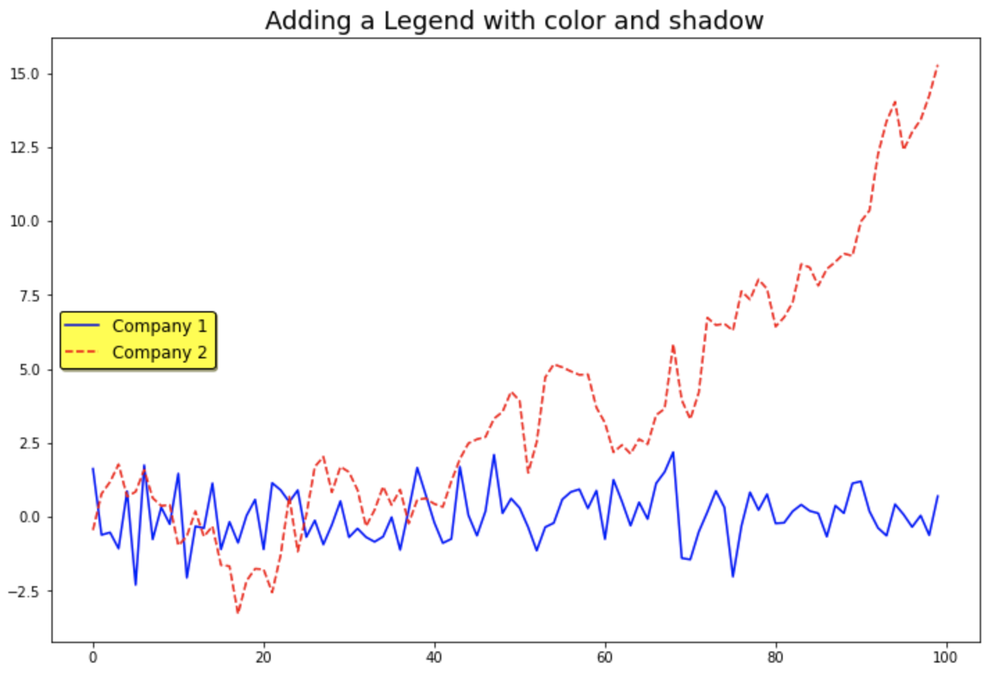
범례의 위치(location) 을 지정하려면 loc 매개변수에 location strings 인 'best', 'upper right', 'upper left', 'lower left', 'lower right', 'right', 'center left', 'center right', 'lower center', 'upper center', 'center' 중에서 하나를 선택해서 입력해주면 됩니다. 기본설정값은 loc='best' 로서 컴퓨터가 알아서 가장 적절한 여백을 가지는 위치에 범례를 생성해주는데요, 나름 똑똑하게 잘 위치를 선택해서 범례를 추가해줍니다.
그밖에 범례의 폰트 크기(fontsize), 범례의 배경 색깔(facecolor, 기본설정값은 'white'), 범례의 테두리선 색깔(edgecolor), 범례 상자의 그림자 여부(shadow, 기본설정값은 'False') 등도 사용자가 직접 지정해줄 수 있습니다. (굳이 범례의 스타일을 꾸미는데 시간과 노력을 많이 쏟을 이유는 없을 것 같기는 합니다만....^^;)
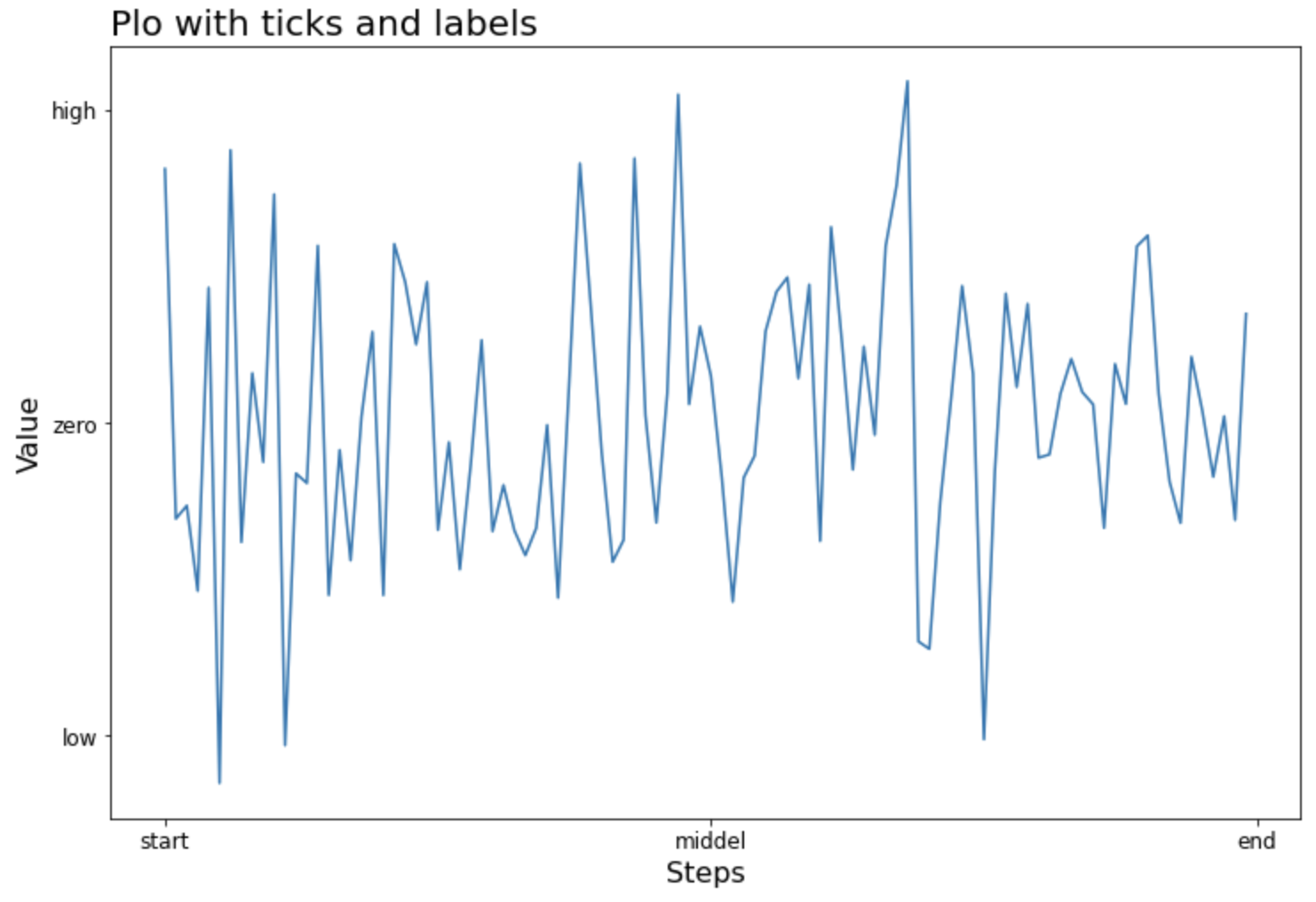
(2) 눈금 이름 설정하기 : set_xticklabels(), set_yticklabels()
(3) 축 이름 설정하기 : set_xlabel(), set_ylabel()
(4) 제목 설정하기 : set_title()
하는 방법을 소개하겠습니다.
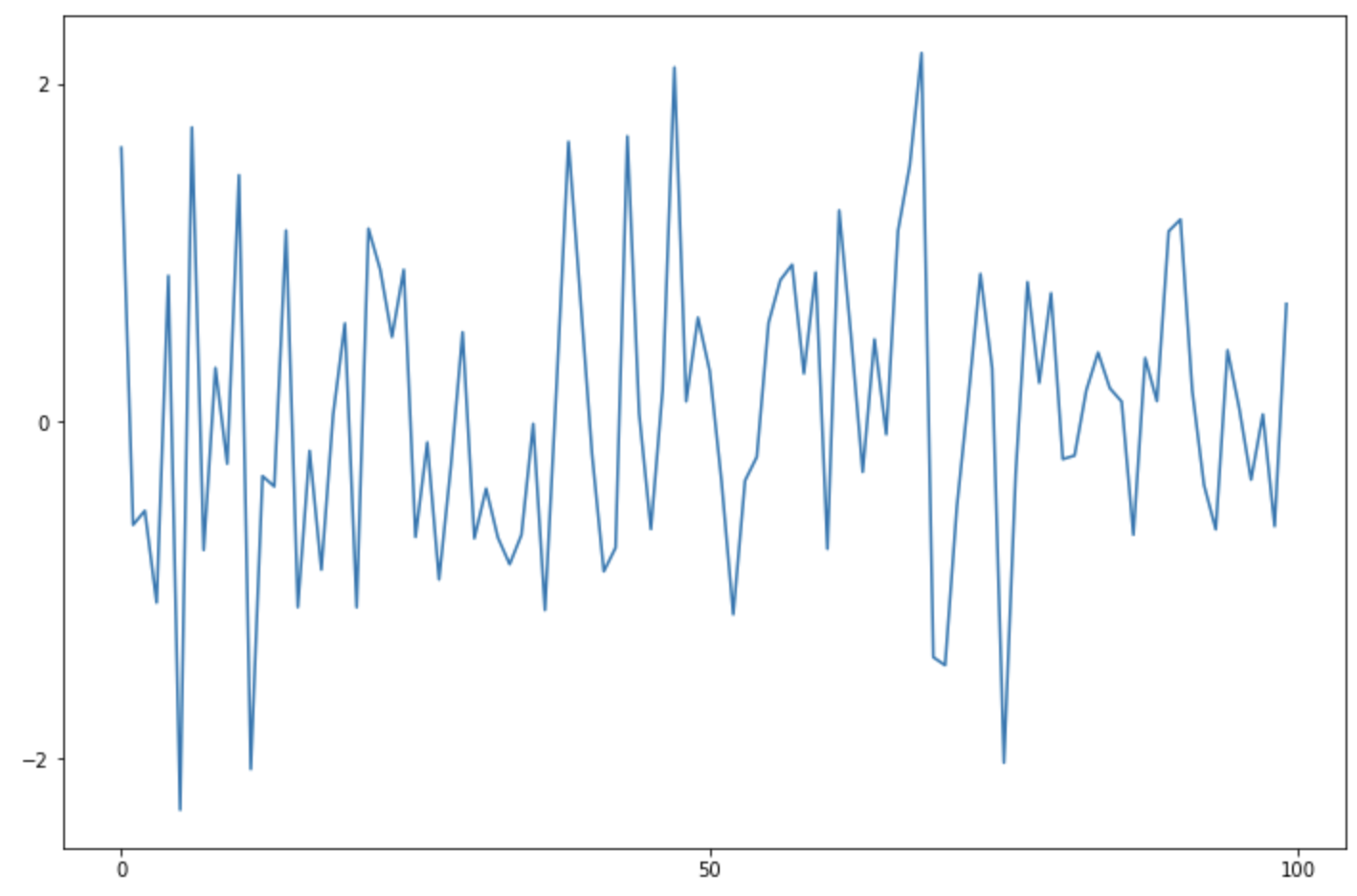
먼저, numpy 모듈을 사용해서 표준정규분포 X~N(0, 1) 로부터 난수 100개를 생성해서 matplotlib의 기본 설정으로 선 그래프를 그려보겠습니다. matplotlib의 Figure 객체를 만들고, fig.add_subplot(1, 1, 1) 로 하위 플롯을 하나 만든 다음에 선 그래프를 그렸습니다.
import matplotlib.pyplot as plt
import numpy as np

fig = plt.figure(figsize=(12, 8))
ax = fig.add_subplot(1, 1, 1)

np.random.seed(1)
x=np.arange(100)
y=np.random.normal(0, 1, 100)

## plot with default setting
ax.plot(x, y)
plt.show()
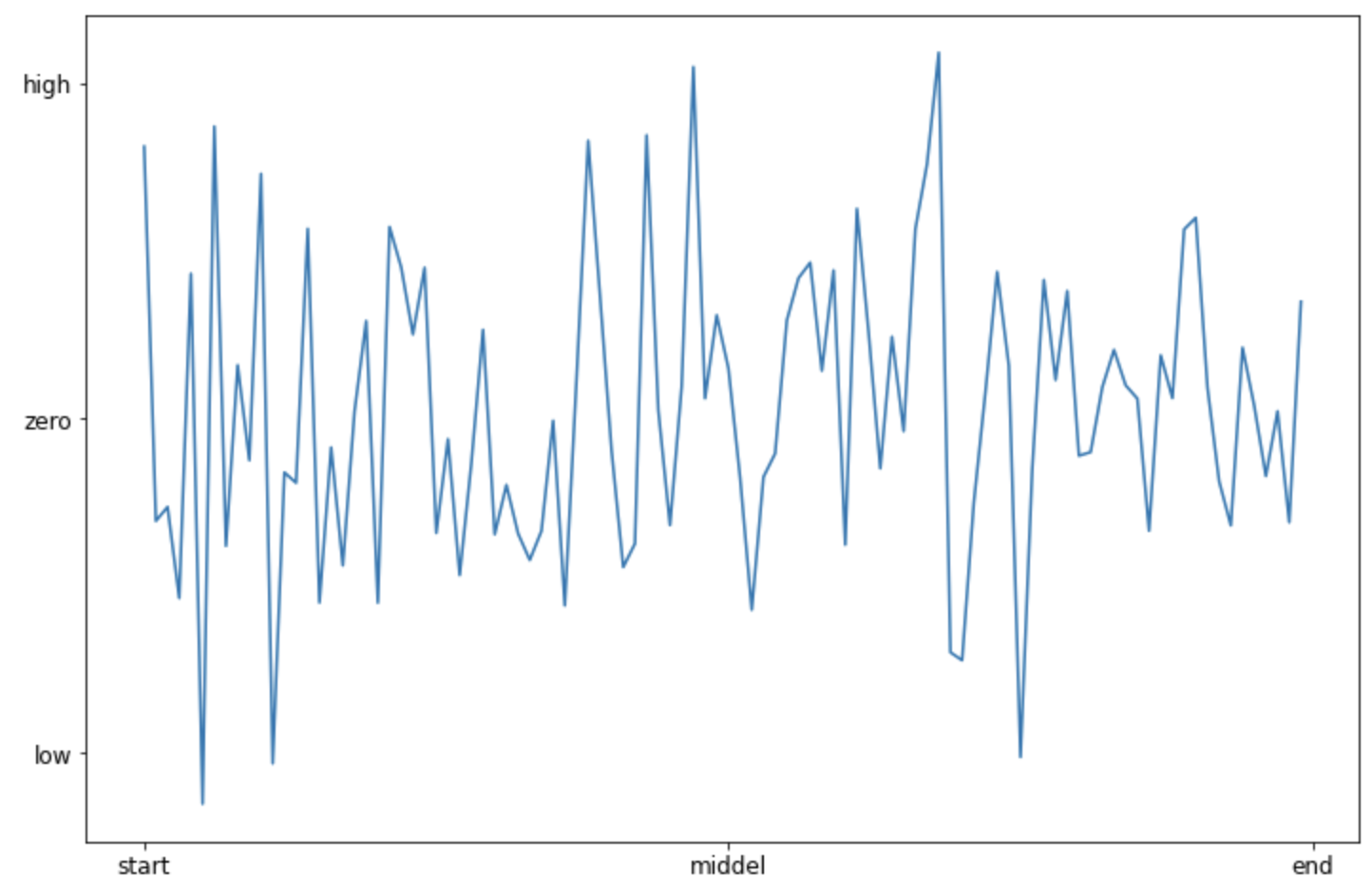
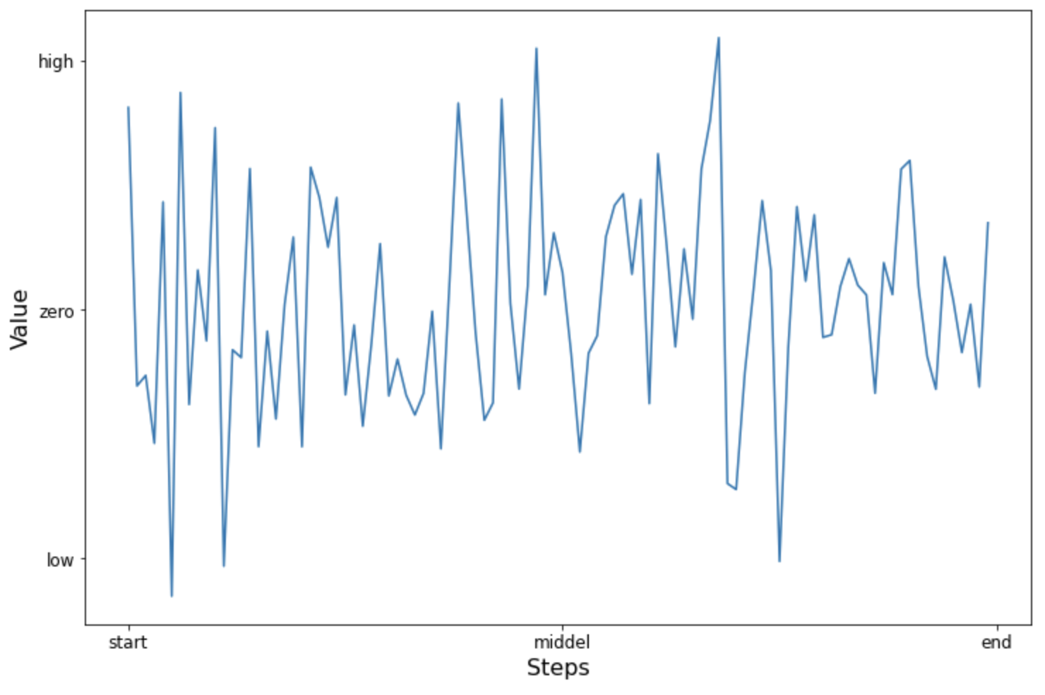
(1) 눈금 설정하기 : set_xticks(), set_yticks()
X축의 눈금을 [0, 50, 100] 으로 설정하고, Y축의 눈금은 [-2, 0, 2] 로 설정해보겠습니다.
(2) 눈금 이름 설정하기 : set_xticklabels(), set_yticklabels()
X축과 Y축에 눈금이름(xticklabel, yticklabel)을 설정해줄 수도 있습니다. 이때 set_xticks(), set_yticks() 메소드로 눈금의 위치를 먼저 설정해주고, 이어서 같은 개수의 눈금 이름을 가지고 set_xticklabels(), set_yticklabels() 메소드로 눈금 이름을 설정해주면 됩니다.
여러개의 그래프를 위/아래 또는 왼쪽/오른쪽으로 붙여서 시각화를 한 후에 비교를 해보고 싶을 때가 있습니다. 그리고 측정 단위가 서로 같을 경우에는 x축, y축을 여러개의 그래프와 공유하면서 동일한 scale의 눈금으로 시각화 함으로써 그래프 간 비교를 더 쉽고 정확하게 할 수 있습니다.
이번 포스팅에서는
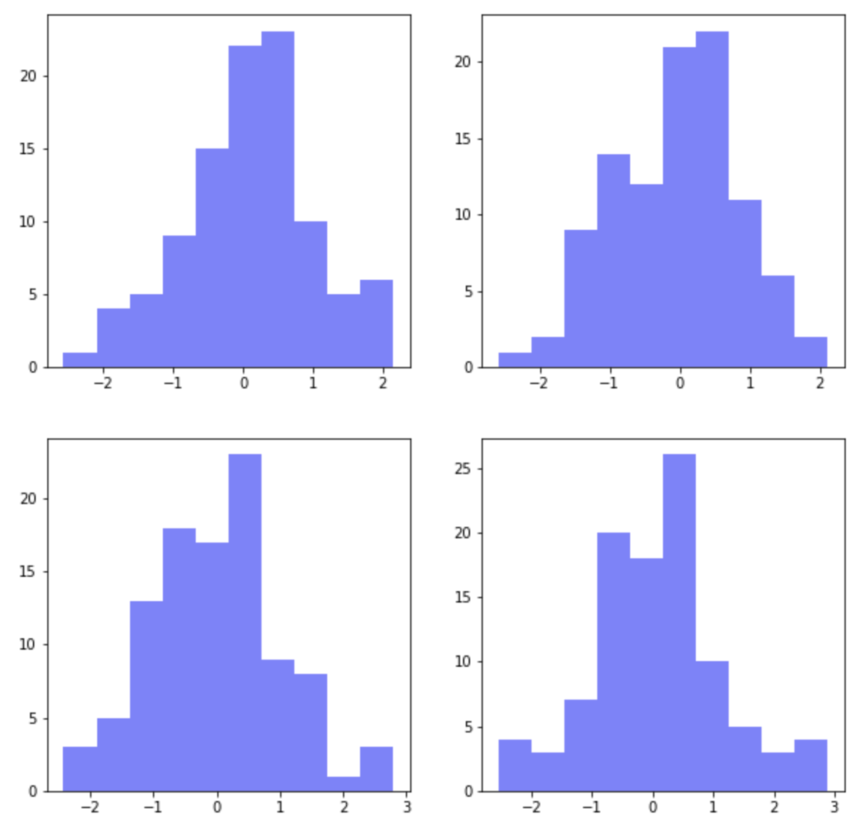
(1) 여러개의 하위 플롯 그리기: plt.subplots(nrows=2, ncols=2)
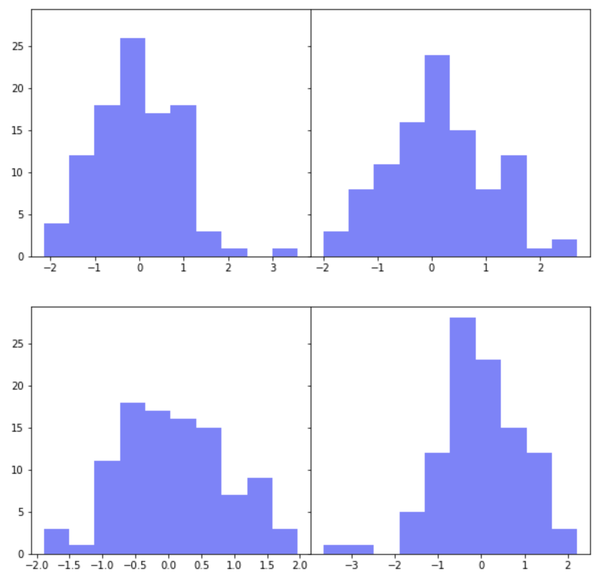
먼저, plt.subplots(nrows=2, ncols=2) 로 2개 행, 2개 열의 layout 을 가지는 하위 플롯을 그려보겠습니다. 평균=0, 표준편차=1을 가지는 표준정규분포로 부터 100개의 난수를 생성해서 파란색(color='b')의 약간 투명한(alpha=0.5) 히스토그램을 그려보겠습니다.
for loop 을 돌면서 2 x 2 의 레이아웃에 하위 플롯이 그려질때는 왼쪽 상단이 1번, 오른쪽 상단이 2번, 왼쪽 하단이 3번, 오른쪽 하단이 4번의 순서로 하위 그래프가 그려집니다.
이렇게 하위 플롯이 그려질 때 자동으로 하위 플롯 간 여백(padding)을 두고 그래프가 그려지며, X축과 Y축은 공유되지 않고 각각 축을 가지고 그려집니다.
import numpy as np
import pandas as pd
import matplotlib.pyplot as plt

## subplots with 2 by 2
## (1) there are paddings between subplots
## (2) x and y axes are not shared
fig, axes = plt.subplots(
    nrows=2,
    ncols=2,
    figsize=(10, 10))

for i in range(2):
    for j in range(2):
        axes[i, j].hist(
            np.random.normal(loc=0, scale=1, size=100),
            color='b',
            alpha=0.5)
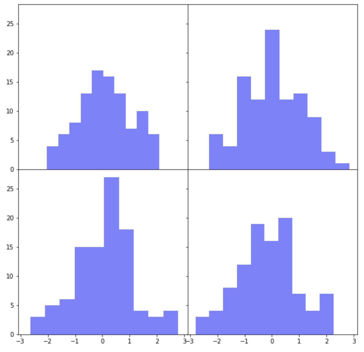
여러개의 하위 플롯 간에 X축과 Y축을 공유하려면 plt.subplots()의 옵션 중에서 sharex=True, sharey=True를 설정해주면 됩니다.
그리고 하위 플롯들 간의 간격을 없애서 그래프를 서로 붙여서 그리고 싶다면 두가지 방법이 있습니다. 먼저, plt.subplots_adjust(wspace=0, hspace=0) 에서 wspace 는 폭의 간격(width space), hspace 는 높이의 간격(height space) 을 설정하는데 사용합니다.
fig, axes = plt.subplots(
    nrows=2, ncols=2,
    sharex=True, # sharing properties among x axes
    sharey=True, # sharing properties among y axes
    figsize=(10, 10))

for i in range(2):
    for j in range(2):
        axes[i, j].hist(
            np.random.normal(loc=0, scale=1, size=100),
            color='b',
            alpha=0.5)

## adjust the subplot layout
plt.subplots_adjust(
    wspace=0, # the width of the padding between subplots
    hspace=0) # the height of the padding between subplots
matplotlib subplots adjust
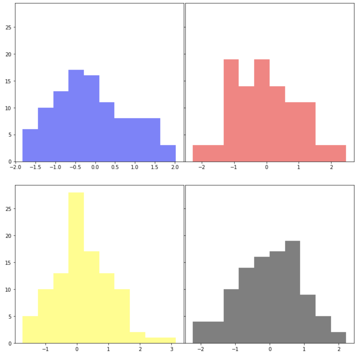
아래 예제에서는 plt.subplots(sharex=False, sharey=True) 로 해서 X축은 공유하지 않고 Y축만 공유하도록 했습니다.
그리고 plt.subplots_adjust(wspace=0, hspace=0.2) 로 해서 높이의 간격(height space)에만 0.2 만큼의 간격을 부여해주었습니다.
fig, axes = plt.subplots(
    nrows=2, ncols=2,
    sharex=False, # sharing properties among x axes
    sharey=True, # sharing properties among y axes
    figsize=(10, 10))

for i in range(2):
    for j in range(2):
        axes[i, j].hist(
            np.random.normal(loc=0, scale=1, size=100),
            color='b',
            alpha=0.5)

## adjust the subplot layout
plt.subplots_adjust(
    wspace=0, # the width of the padding between subplots
    hspace=0.2) # the height of the padding between subplots
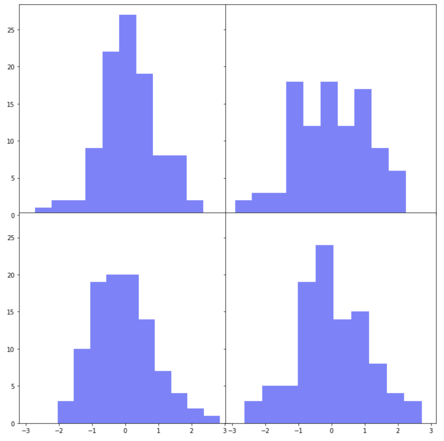
(3) 여러개의 하위 플롯들 간의 간격을 조절해서 붙이기
: (3-2)plt.tight_layout(h_pad=-1, w_pad=-1)
하위 플롯 간 간격을 조절하는 두번째 방법으로는 plt.tight_layout(h_pad, w_pad) 을 사용하는 방법입니다. plt.tight_layout(h_pad=-1, w_pad=-1)로 설정해서 위의 2번에서 했던 것처럼 4개의 하위 플롯 간에 간격이 없이 모두 붙여서 그려보겠습니다. (참고: h_pad=0, w_pad=0 으로 설정하면 하위 플롯간에 약간의 간격이 있습니다.)
fig, axes = plt.subplots(
    nrows=2, ncols=2,
    sharex=True, # sharing properties among x axes
    sharey=True, # sharing properties among y axes
    figsize=(10, 10))

for i in range(2):
    for j in range(2):
        axes[i, j].hist(
            np.random.normal(loc=0, scale=1, size=100),
            color='b',
            alpha=0.5)

## adjusting the padding between and around subplots
plt.tight_layout(
    h_pad=-1, # padding height between edges of adjacent subplots
    w_pad=-1) # padding width between edges of adjacent subplots
matplotlib subplots tight_layout
X축은 공유하지 않고 Y축만 공유하며, plt.tight_layout(h_pad=3, w_pad=0) 으로 설정해서 높이 간격을 벌려보겠습니다. 그리고 하위 플롯이 그려지는 순서대로 'blue', 'red', 'yellow', 'black' 의 색깔을 입혀보겠습니다.
fig, axes = plt.subplots(
    nrows=2, ncols=2,
    sharex=False, # sharing properties among x axes
    sharey=True, # sharing properties among y axes
    figsize=(10, 10))

color = ['blue', 'red', 'yellow', 'black']
k=0
for i in range(2):
    for j in range(2):
        axes[i, j].hist(
            np.random.normal(loc=0, scale=1, size=100),
            color=color[k],
            alpha=0.5)
        k +=1

## adjusting the padding between and around subplots
plt.tight_layout(
    h_pad=3, # padding height between edges of adjacent subplots
    w_pad=0) # padding width between edges of adjacent subplots
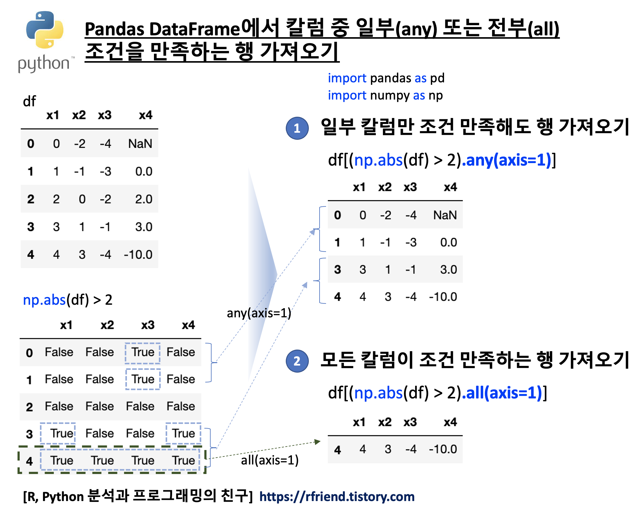
(2) pandas DataFrame 의 칼럼 중에서 모든 칼럼이 True 인 행 가져오기: pd.DataFrame.all(axis=1)
이번에는 pandas.DataFrame.all(axis=1)을 이용해서 DataFrame에 있는 4개의 모든 칼럼이 조건을 만족하는 행만 가져오기를 해보겠습니다.
## DataFrame.all(axis=0, bool_only=None, skipna=True, level=None, **kwargs)
## Return whether all elements are True, potentially over an axis.

df[(np.abs(df) > 2).all(axis=1)]
#    x1	  x2	 x3	  x4
# 4	 4	3	-4	-10.0
아래는 pandas.DataFrame.all() 메소드를 사용하지 않고, 대신에 조건 만족여부에 대한 블리언 값을 칼럼 축으로 전부 더한 후, 이 블리언 합이 칼럼 개수와 동일한 행을 가져와본 것입니다. 위의 pandas.DataFrame.all(axis=1) 보다 코드가 좀더 길고 복잡합니다.
위에서 만든 1억개의 원소를 가지는 배열을 가지고 조건값으로 True/False 블리언 값 여부에 따라서 True 조건값 이면 xarr 배열 내 값을 가지고, False 조건값이면 yarr 배열 내 값을 가지는 새로운 배열을 만들어보겠습니다. 이때 (1) List Comprehension 방법과, (2) NumPy의 Vectorized Operations 방법 간 수행 시간을 측정해서 어떤 방법이 더 빠른지 성능을 비교해보겠습니다.
(물론, Vectorized Operations이 for loop 순환문을 사용하는 List Comprehension보다 훨~씬 빠릅니다! 눈으로 직접 확인해 보겠습니다. )
## Let's compare the elapsed time between 2 methods
## (list comprehension vs. vectorized operations)

## (1) List Comprehension
new_arr = [(x if c else y) for (x, y, c) in zip(xarr, yarr, cond)]

## (2) Vectorized Operations in NumPy
new_arr = np.where(cond, xarr, yarr)
(1)datetime.now() 메소드 이용해서 실행 시간 측정하기
datetime 모듈은 날짜, 시간, 시간대(time zone) 등을 다루는데 사용하는 모듈입니다 datetime.now() 메소드는 현재의 로컬 날짜와 시간을 반환합니다. 실행 시간을 측정할 코드 바로 앞에 start_time = datetime.now() 로 시작 날짜/시간을 측정해놓고, 실행할 코드가 끝난 다음 줄에 time_elapsed = datetime.now() - start_time 으로 '끝난 날짜/시간'에서 '시작 날짜/시간'을 빼주면 '코드 실행 시간'을 계산할 수 있습니다.
아래 결과를 비교해보면 알 수 있는 것처럼, for loop 순환문을 사용하는 List Comprehension 방법보다 NumPy의 Vectorized Operation이 약 38배 빠른 것으로 나오네요.
## (1) -- measuring the elapsed time using datetime

## (a) List Comprehension
from datetime import datetime
start_time = datetime.now()
list_comp_for_loop = [(x if c else y) for (x, y, c) in zip(xarr, yarr, cond)]
time_elapsed = datetime.now() - start_time

print('Time elapsed (hh:mm:ss.ms) {}'.format(time_elapsed))
# Time elapsed (hh:mm:ss.ms) 0:00:17.753036

np.array(list_comp_for_loop)[:10]
# array([0., 1., 2., 0., 0., 5., 6., 7., 8., 9.])


## (b) Vectorized Operations in NumPy
start_time = datetime.now()
np_where_vectorization = np.where(cond, xarr, yarr)
time_elapsed = datetime.now() - start_time

print('Time elapsed (hh:mm:ss.ms) {}'.format(time_elapsed))
# Time elapsed (hh:mm:ss.ms) 0:00:00.462215

np_where_vectorization[:10]
# array([0., 1., 2., 0., 0., 5., 6., 7., 8., 9.])
(2) %timeit 로 실행 시간 측정하기
다음으로 Python timeit 모듈을 사용해서 짧은 코드의 실행 시간을 측정해보겠습니다. timeit 모듈은 터미널의 command line 과 Python IDE 에서 호출 가능한 형태의 코드 둘 다 사용이 가능합니다.
아래에는 Jupyter Notebook에서 %timeit [small code snippets] 로 코드 수행 시간을 측정해본 예인데요, 여러번 수행을 해서 평균 수행 시간과 표준편차를 보여주는 특징이 있습니다.
## (2) measuring the elapsed time using timeit

## (a) List Comprehension
import timeit

%timeit list_comp_for_loop = [(x if c else y) for (x, y, c) in zip(xarr, yarr, cond)]
# 17.1 s ± 238 ms per loop (mean ± std. dev. of 7 runs, 1 loop each)


## (b) Vectorized Operations in NumPy
%timeit np_where_vectorization = np.where(cond, xarr, yarr)
# 468 ms ± 8.75 ms per loop (mean ± std. dev. of 7 runs, 1 loop each)
다음으로, 원소별 개수를 세서 저장할 비어있는 Dictionary 인 counts={} 를 만들어놓고, for loop 순환문으로 리스트의 원소를 하나씩 순서대로 가져다가 Dictionary counts 의 Key 값에 해당 원소가 들어있으면 +1을 하고, Key 값에 해당 원소가 안들어 있으면 해당 원소를 Key 값으로 등록하고 1 을 값으로 입력해 줍니다.
def get_counts(seq):
    counts = {}
    for x in seq:
        if x in counts:
            counts[x] += 1
        else:
            counts[x] = 1
    return counts


counts = get_counts(my_list)


print(counts)
# {'a': 5, 'f': 2, 'b': 3, 'c': 4, 'e': 1}


## access value by key
counts['a']
# 5
(2) 원소별 개수를 세어놓은 Dictionary에서 개수 상위 n 개의 {Key:Value} 쌍을 가져오기
Dictionary를 정렬하는 방법에 따라서 두 가지 방법이 있습니다.
(a) sorted() 메소드를 이용해서 key=lambda x: x[1] 로 해서 정렬 기준을 Dictionary의 Value 로 하여 내림차순으로 정렬(reverse=True) 하고, 상위 n 개까지만 슬라이싱해서 가져오는 방법입니다.
(b) 아래는 dict.items() 로 (Key, Value) 쌍을 for loop 문을 돌리면서 (Value, Key) 로 순서를 바꿔서 리스트 [] 로 만들고 (list comprehension), 이 리스트에 대해서 sort(reverse=True) 로 Value 를 기준으로 내림차순 정렬한 후에, 상위 n 개까지만 슬라이싱해서 가져오는 방법입니다.
## way2
## reference: https://rfriend.tistory.com/281
def top_n2(count_dict, n=3):
    val_key = [(v, k) for k, v in count_dict.items()]
    val_key.sort(reverse=True)
    return val_key[:n]

## getting top 2
top_n2(counts, n=2)
# [(5, 'a'), (4, 'c')]
먼저, 예제로 사용할 간단한 pandas DataFrame을 만들어보겠습니다. index 로 2000년 ~ 2021년까지의 년도를 사용하고, 성별로 'M', 'F'의 두 개의 칼럼에 포아송분포로 부터 난수를 발생시켜서 만든 도수(frequency)를 가지는 DataFrame 입니다.
import numpy as np
import pandas as pd
import matplotlib.pyplot as plt


## creating a sample DataFrame
ts = np.arange(2000, 2022) # from year 2000 to 2021

print(ts)
# [2000 2001 2002 2003 2004 2005 2006 2007 2008 2009 2010 2011 2012 2013
#  2014 2015 2016 2017 2018 2019 2020 2021]

np.random.seed(1) # for reproducibility
M = np.arange(len(ts)) + np.random.poisson(lam=10, size=len(ts))
F = np.arange(len(ts))[::-1] + np.random.poisson(lam=2, size=len(ts))

df = pd.DataFrame({'M': M, 'F': F}, index=ts)

df.head()
#       M	F
# 2000	9	21
# 2001	7	24
# 2002	9	20
# 2003	12	19
# 2004	13	18
(1) TimeStamp 행별로 칼럼별 비율을 구하기
먼저, pandas DataFrame 에서 합(sum)을 구할 때 각 TimeStamp 별로 칼럼 축(axis = 1) 으로 합을 구해보겠습니다.
참고로, index 축으로 칼럼별 합을 구할 때는 df.sum(axis=0) 을 해주면 됩니다. sum(axis=0) 이 기본설정값이므로 df.sum() 하면 동일한 결과가 나옵니다.
## summation by index axis
df.sum(axis=0) # default setting

# M    426
# F    274
# dtype: int64
pandas DataFrame에서 div() 메소드를 사용하면 각 원소를 특정 값으로 나눌 수 있습니다. 가령, 위의 예제 df DataFrame의 각 원소를 10으로 나눈다고 하면 아래처럼 df.div(10) 이라고 해주면 됩니다. (나누어주는 값 '10' 이 broadcasting 되어서 각 원소를 나누어주었음.)
## pd.DataFrame.div()
## : Get Floating division of dataframe and other,
##   element-wise (binary operator truediv).
df.div(10).head()

#         M	F
# 2000	0.9	2.1
# 2001	0.7	2.4
# 2002	0.9	2.0
# 2003	1.2	1.9
# 2004	1.3	1.8
이제 df DataFrame의 각 원소를 각 원소가 속한 TimeStamp별로 칼럼 축(axis=1)으로 합한 값(df.sum(axis=1))으로 나누어주면 우리가 구하고자 하는 각 TimeStamp별 칼럼별 비율을 구할 수 있습니다.
pandas DataFrame 의 plot() 메소드를 사용하면 편리하게 시계열 도표를 그릴 수 있습니다. 이때 성별을 나타내는 칼럼 'M', 'F' 별로 선의 모양(line type)과 색깔(color) 을 style={'M': 'b--', 'F': 'r-'} 매개변수를 사용해서 다르게 해서 그려보겠습니다. ('M' 은 파란색 점선, 'F' 는 빨간색 실선)
ARIMA 모형과 같은 통계적 시계열 예측 모델의 경우 시계열데이터의 정상성 가정을 충족시켜야 합니다. 따라서 만약 시계열 데이터가 비정상 확률 과정 (non-stationary process) 이라면, 먼저 시계열 데이터 변환을 통해서 정상성(stationarity)을 충족시켜주어야 ARIMA 모형을 적합할 수 있습니다.
이번 포스팅에서는 Python을 사용하여
(1) 분산이 고정적이지 않은 경우 분산 안정화 변환 (variance stabilizing transformation, VST)
(2) 추세가 있는 경우 차분을 통한 추세 제거 (de-trend by differencing)
(3) 계절성이 있는 경우 계절 차분을 통한 계절성 제거 (de-seasonality by seaanl differencing)
하는 방법을 소개하겠습니다.
[ 비정상확률과정을 정상확률과정으로 변환하기 (Transforming non-stationary to stationary process) ]
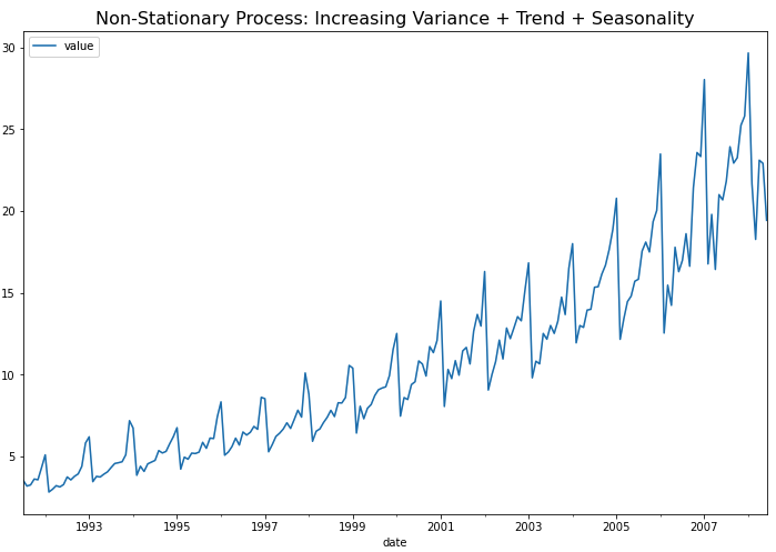
먼저 예제로 사용할 약 판매량 (drug sales) 시계열 데이터를 가져와서 pandas DataFrame으로 만들고, 시계열 그래프를 그려보겠습니다.
위의 시계열 그래프에서 볼 수 있는 것처럼, (a) 분산이 시간의 흐름에 따라 증가 하고 (분산이 고정이 아님), (b) 추세(trend)가 있으며, (c) 1년 주기의 계절성(seasonality)이 있으므로, 비정상확률과정(non-stationary process)입니다.
KPSS 검정을 통해서 확인해봐도 p-value가 0.01 이므로 유의수준 5% 하에서 귀무가설 (H0: 정상 시계열이다)을 기각하고, 대립가설(H1: 정상 시계열이 아니다)을 채택합니다.
## UDF for KPSS test
from statsmodels.tsa.stattools import kpss
import pandas as pd

def kpss_test(timeseries):
    print("Results of KPSS Test:")
    kpsstest = kpss(timeseries, regression="c", nlags="auto")
    kpss_output = pd.Series(
        kpsstest[0:3], index=["Test Statistic", "p-value", "Lags Used"] )

    for key, value in kpsstest[3].items():
        kpss_output["Critical Value (%s)" % key] = value
    print(kpss_output)


## 귀무가설 (H0): 정상 시계열이다
## 대립가설 (H1): 정상 시계열이 아니다 <-- p-value 0.01

kpss_test(df)

# Results of KPSS Test:
# Test Statistic           2.013126
# p-value                  0.010000
# Lags Used                9.000000
# Critical Value (10%)     0.347000
# Critical Value (5%)      0.463000
# Critical Value (2.5%)    0.574000
# Critical Value (1%)      0.739000
# dtype: float64
(1) 분산이 고정적이지 않은 경우 분산 안정화 변환 (variance stabilizing transformation, VST)
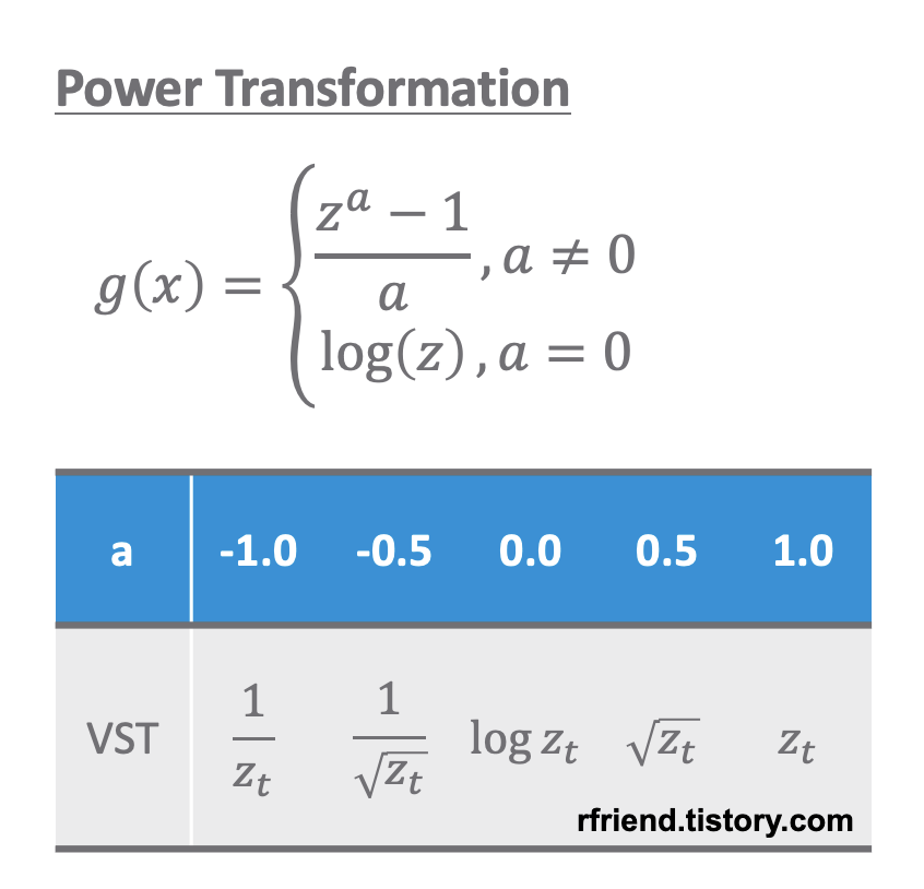
분산이 고정적이지 않은 경우 멱 변환(Power Transformation)을 통해서 분산을 안정화(variance stabilization) 시켜줍니다. 분산이 고정적이지 않고 추세가 있는 경우 분산 안정화를 추세 제거보다 먼저 해줍니다. 왜냐하면 추세를 제거하기 위해 차분(differencing)을 해줄 때 음수(-)가 생길 수 있기 때문입니다.
power transformation
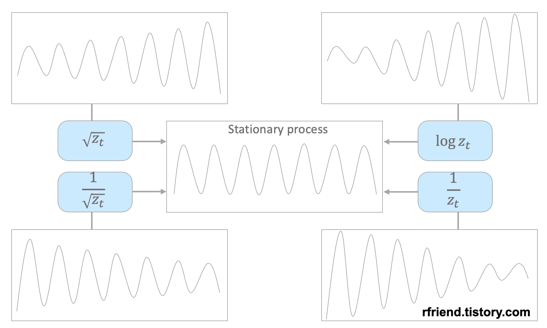
원래의 시계열 데이터의 분산 형태에 따라서 적합한 멱 변환(power transformation)을 선택해서 정상확률과정으로 변환해줄 수 있습니다. 아래의 예제 시도표를 참고하세요.
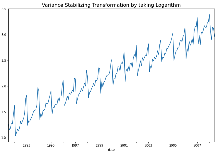
이번 포스팅에서 사용하는 예제는 시간이 흐릴수록 분산이 점점 커지는 형태를 띠고 있으므로 로그 변환(log transformation) 이나 제곱근 변환 (root transformation) 을 해주면 정상 시계열로 변환이 되겠네요. 아래 코드에서는 자연로그를 취해서 로그 변환을 해주었습니다.
Python의 diff() 메소드를 사용해서 차분을 해줄 수 있습니다. 이때 차분의 차수 만큼 결측값이 생기는 데요, dropna() 메소드를 사용해서 결측값은 제거해주었습니다.
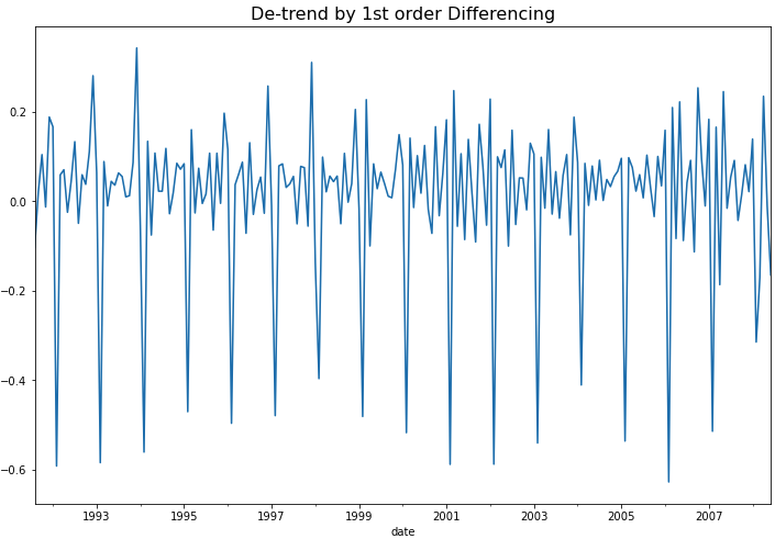
## De-trend by Differencing
df_vst_diff1 = df_vst.diff(1).dropna()

df_vst_diff1.plot(figsize=(12, 8))
plt.title("De-trend by 1st order Differencing", fontsize=16)
plt.show()
de-trending by 1st order differencing
위의 시도표를 보면 1차 차분(1st order differencing)을 통해서 이제 추세(trend)도 제거되었음을 알 수 있습니다. 하지만 아직 계절성(seasonality)이 남아있어서 정상성 조건은 만족하지 않겠네요. 그런데 아래에 KPSS 검정을 해보니 p-value가 0.10 으로서 유의수준 5% 하에서 정상성을 만족한다고 나왔네요. ^^;
## 귀무가설 (H0): 정상 시계열이다  <-- p-value 0.10
## 대립가설 (H1): 정상 시계열이 아니다

kpss_test(df_vst_diff1)

# Results of KPSS Test:
# Test Statistic            0.121364
# p-value                   0.100000
# Lags Used                37.000000
# Critical Value (10%)      0.347000
# Critical Value (5%)       0.463000
# Critical Value (2.5%)     0.574000
# Critical Value (1%)       0.739000
# dtype: float64
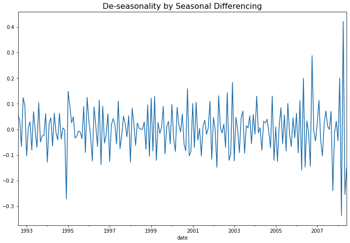
(3) 계절성이 있는 경우 계절 차분을 통한 계절성 제거 (de-seasonality by seaanl differencing)
아직 남아있는 계절성(seasonality)을 계절 차분(seasonal differencing)을 사용해서 제거해보겠습니다. 1년 12개월 주기의 계절성을 띠고 있으므로 diff(12) 함수로 계절 차분을 실시하고, 12개의 결측값이 생기는데요 dropna() 로 결측값은 제거해주었습니다.
## Stationary Process: De-seasonality by Seasonal Differencing
df_vst_diff1_diff12 = df_vst_diff1.diff(12).dropna()

## plotting
df_vst_diff1_diff12.plot(figsize=(12, 8))
plt.title("De-seasonality by Seasonal Differencing",
          fontsize=16)
plt.show()
de-seasonality by seasonal differencing
위의 시도표를 보면 이제 계절성도 제거가 되어서 정상 시계열처럼 보이네요. 아래에 KPSS 검정을 해보니 p-value 가 0.10 으로서, 유의수준 5% 하에서 귀무가설(H0: 정상 시계열이다)을 채택할 수 있겠네요.
## 귀무가설 (H0): 정상 시계열이다  <-- p-value 0.10
## 대립가설 (H1): 정상 시계열이 아니다

kpss_test(df_vst_diff1_diff12)

# Results of KPSS Test:
# Test Statistic           0.08535
# p-value                  0.10000
# Lags Used                8.00000
# Critical Value (10%)     0.34700
# Critical Value (5%)      0.46300
# Critical Value (2.5%)    0.57400
# Critical Value (1%)      0.73900
# dtype: float64
이제 비정상 시계열(non-stationary process)이었던 원래 데이터를 (1) log transformation을 통한 분산 안정화, (2) 차분(differencing)을 통한 추세 제거, (3) 계절 차분(seasonal differencing)을 통한 계절성 제거를 모두 마쳐서 정상 시계열(stationary process) 로 변환을 마쳤으므로, ARIMA 통계 모형을 적합할 수 있게 되었습니다.
지난번 포스팅에서는 백색잡음과정(White noise process), 확률보행과정(Random walk process), 정상확률과정(Stationary process)에 대해서 소개하였습니다. (https://rfriend.tistory.com/691)
지난번 포스팅에서 특히 ARIMA와 같은 시계열 통계 분석 모형이 정상확률과정(Stationary Process)을 가정한다고 했습니다. 따라서 시계열 통계 모형을 적합하기 전에 분석 대상이 되는 시계열이 정상성 가정(Stationarity assumption)을 만족하는지 확인을 해야 합니다.
[ 정상확률과정 (stationary process) 정의 ]
1. 평균이 일정하다. 2. 분산이 존재하며, 상수이다. 3. 두 시점 사이의 자기공분산은 시차(時差, time lag)에만 의존한다.
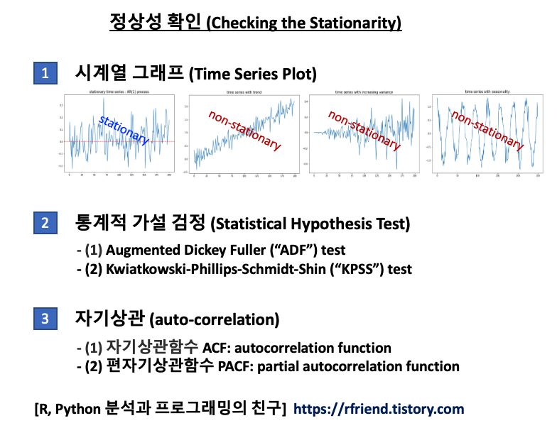
정상 시계열 (stationary time series) 여부를 확인하는 방법에는 3가지가 있습니다.
[1] 시계열 그래프 (time series plot)
[2] 통계적 가설 검정 (statistical hypothesis test)
[3] 자기상관함수(ACF), 편자기상관함수(PACF)
정상성 확인하는 방법 (how to check the stationarity)
이번 포스팅에서는 이중에서 통계적 가설 검정 (Statistical Hypothesis Test) 을 이용해 정상성(stationarity) 여부를 확인하는 방법을 소개하겠습니다.
ADF 검정은 시계열에 단위근(unit root)이 존재하는지의 여부를 검정함으로써 정상 시계열인지 여부를 판단합니다. 단위근이 존재하면 정상 시계열이 아닙니다.
단위근(unit root)이란 확률론의 데이터 검정에서 쓰이는 개념입니다. 주로 ‘단위근 검정’의 형식으로 등장합니다. 일반적으로 시계열 데이터는 시간에 따라 일정한 규칙을 가짐을 가정합니다. 따라서 매우 복잡한 형태를 갖는 시계열 데이터라도 다음과 같은 식으로 어떻게든 단순화시킬 수 있을 것이라 생각해볼 수 있습니다.
즉, ‘t시점의 확률변수는 t-1, t-2 시점의 확률변수와 관계를 가지면서 거기에 에러가 포함된 것’이라는 의미입니다. 여기서 편의를 위해 y0=0이라 가정합니다. 이제 아래의 방정식을 볼까요.
여기서 m=1이 위 식의 근이 된다면 이때의 시계열 과정을 단위근을 가진다고 합니다. 단위근 모형은 주로 복잡한 시계열 데이터를 단순하게나마 계산하려 할 때 사용됩니다.
Python으로 가상의 시계열 데이터셋(1개의 정상 시계열, 3개의 비정상 시계열)을 만들어서 위의 ADF test, KPSS test 를 각각 해보겠습니다. 위의 정상확률과정의 정의에 따라서, 추세(trend)가 있거나, 분산(variance)이 시간의 흐름에 따라 변하거나(증가 또는 감소), 계절성(seasonality)을 가지고 있는 시계열은 정상성(stationarity) 가정을 만족하지 않습니다.
- (1) 정상 시계열 데이터 (stationary time series)
- (2) 추세를 가진 비정상 시계열 데이터 (non-stationary time series with trend)
- (3) 분산이 변하는 비정상 시계열 데이터 (non-stationary time series with changing variance)
- (4) 계절성을 가지는 비정상 시계열 데이터 (non-stationary time series with seasonality)
이제 (1)~(4)번 데이터별로 (a) ADF test, (b) KPSS test 로 정상성 여부를 차례대로 가설 검정해보겠습니다.
(1) 정상 시계열 데이터 (stationary time series)
먼저, 자기회귀과정(auto-regressive process)을 따르는 AR(1) 과정의 시계열 데이터를 임의로 만들어보겠습니다.
import numpy as np
import matplotlib.pyplot as plt

## Stationary Process
## exmaple: AR(1) process
np.random.seed(1) # for reproducibility
z_0 = 0
rho = 0.6 # correlation b/w z(t) and z(t-1)
z_all = [z_0]

for i in range(200):
    z_t = rho*z_all[i] + np.random.normal(0, 0.1, 1)
    z_all.append(z_t)

## plotting
plt.rcParams['figure.figsize'] = (10, 6)
plt.plot(z_all)
plt.title("stationary time series : AR(1) process", fontsize=16)

## adding horizonal line at mean position 0
plt.axhline(0, 0, 200, color='red', linestyle='--', linewidth=2)
plt.show()
stationary process time series, 정상 시계열
(1-a) ADF 검정 (Augmented Dickey-Fuller test)
Python의 statsmodels 모듈에 있는 adfuller 메소드를 사용해서 ADF 검정을 위한 사용자 정의함수를 정의해보겠습니다.
#! pip install statsmodels

## UDF for ADF test
from statsmodels.tsa.stattools import adfuller
import pandas as pd

def adf_test(timeseries):
    print("Results of Dickey-Fuller Test:")
    dftest = adfuller(timeseries, autolag="AIC")
    dfoutput = pd.Series(
        dftest[0:4],
        index=[
            "Test Statistic",
            "p-value",
            "#Lags Used",
            "Number of Observations Used",
        ],
    )
    for key, value in dftest[4].items():
        dfoutput["Critical Value (%s)" % key] = value
    print(dfoutput)
이제 위에서 만든 ADF 검정 사용자정의함수 adf_test() 를 사용해서 정상시계열 z_all 에 대해서 ADF 검정을 해보겠습니다. p-value 가 8.74e-11 이므로 유의수준 5% 하에서 귀무가설 (H0: 단위근(unit root)이 존재한다. 즉, 정상 시계열이 아니다)을 기각하고 대립가설 (H1: 단위근이 없다. 즉, 정상 시계열이다.) 을 채택합니다. (맞음 ^_^)
## checking the stationarity of a series using the ADF(Augmented Dickey-Fuller) Test
# -- Null Hypothesis: The series has a unit root.(not stationary.)
# -- Alternate Hypothesis: The series has no unit root.(stationary.)

adf_test(z_all)  # p-value 8.740428e-11 => stationary

# Results of Dickey-Fuller Test:
# Test Statistic                -7.375580e+00
# p-value                        8.740428e-11
# #Lags Used                     1.000000e+00
# Number of Observations Used    1.990000e+02
# Critical Value (1%)           -3.463645e+00
# Critical Value (5%)           -2.876176e+00
# Critical Value (10%)          -2.574572e+00
# dtype: float64
## UDF for KPSS test
from statsmodels.tsa.stattools import kpss
import pandas as pd

def kpss_test(timeseries):
    print("Results of KPSS Test:")
    kpsstest = kpss(timeseries, regression="c", nlags="auto")
    kpss_output = pd.Series(
        kpsstest[0:3], index=["Test Statistic", "p-value", "Lags Used"]
    )
    for key, value in kpsstest[3].items():
        kpss_output["Critical Value (%s)" % key] = value
    print(kpss_output)
이제 정상 시계열 z_all 에 대해서 위에서 정의한 kpss_test() 함수를 사용해서 정상성 여부를 확인해보겠습니다. p-value 가 0.065 로서 유의수준 10% 하에서 귀무가설 (H0: 정상 시계열이다) 를 채택하고, 대립가설 (H1: 정상 시계열이 아니다) 를 기각합니다. (유의수준 5% 하에서는 대립가설 채택). (맞음 ^_^)
kpss_test(z_all) # p-value 0.065035 => stationary at significance level 10%

# Results of KPSS Test:
# Test Statistic           0.428118
# p-value                  0.065035
# Lags Used                5.000000
# Critical Value (10%)     0.347000
# Critical Value (5%)      0.463000
# Critical Value (2.5%)    0.574000
# Critical Value (1%)      0.739000
# dtype: float64
(2) 추세를 가진 비정상 시계열 데이터 (non-stationary time series with trend)
다음으로, 추세(trend)를 가지는 가상의 비정상(non-stationary) 시계열 데이터를 만들어보겠습니다. 평균이 일정하지 않으므로 비정상 시계열이 되겠습니다.
## time series with trend
np.random.seed(1) # for reproducibility
ts_trend = 0.01*np.arange(200) + np.random.normal(0, 0.2, 200)

## plotting
plt.plot(ts_trend)
plt.title("time series with trend", fontsize=16)

plt.show()
time series with trend (non-stationary process)
(2-a) ADF 검정 (ADF test)
위의 추세를 가지는 비정상 시계열 데이터에 대해 ADF 검정 (ADF test)를 실시해보면, p-value가 0.96 으로서 유의수준 5% 하에서 귀무가설 (H0: 시계열이 단위근을 가진다. 즉, 정상 시계열이 아니다) 을 채택하고, 귀무가설 (H1: 시계열이 단위근을 가지지 않는다. 즉, 정상 시계열이다.) 을 기각합니다. (맞음 ^_^)
## checking the stationarity of a series using the ADF(Augmented Dickey-Fuller) Test
# -- Null Hypothesis: The series has a unit root.(not stationary.)
# -- Alternate Hypothesis: The series has no unit root.(stationary.)

adf_test(ts_trend) # p-value 0.96 => non-stationary

# Results of Dickey-Fuller Test:
# Test Statistic                   0.125812
# p-value                          0.967780
# #Lags Used                      10.000000
# Number of Observations Used    189.000000
# Critical Value (1%)             -3.465431
# Critical Value (5%)             -2.876957
# Critical Value (10%)            -2.574988
# dtype: float64
(2-b) KPSS 검정 (KPSS test)
추세(trend)를 가지는 시계열에 대해 KPSS 검정(KPSS test)을 실시해보면, p-value 가 0.01 로서 귀무가설 (H0: 정상 시계열이다) 를 기각하고, 대립가설 (H1: 정상 시계열이 아니다) 를 채택합니다. (맞음 ^_^)
## KPSS test for checking the stationarity of a time series.
## The null and alternate hypothesis for the KPSS test are opposite that of the ADF test.
# -- Null Hypothesis: The process is trend stationary.
# -- Alternate Hypothesis: The series has a unit root (series is not stationary).

kpss_test(ts_trend) # p-valie 0.01 => non-stationary

# Results of KPSS Test:
# Test Statistic           2.082141
# p-value                  0.010000
# Lags Used                9.000000
# Critical Value (10%)     0.347000
# Critical Value (5%)      0.463000
# Critical Value (2.5%)    0.574000
# Critical Value (1%)      0.739000
# dtype: float64
(3) 분산이 변하는 비정상 시계열 데이터 (non-stationary time series with changing variance)
다음으로, 추세는 없지만 시간이 흐름에 따라서 분산이 점점 커지는 가상의 비정상 시계열을 만들어보겠습니다. 분산이 일정하지 않기 때문에 정상 시계열이 아닙니다.
## time series with increasing variance
np.random.seed(1) # for reproducibility
ts_variance = []

for i in range(200):
    ts_new = np.random.normal(0, 0.001*i, 200).astype(np.float32)[0]
    ts_variance.append(ts_new)

## plotting
plt.plot(ts_variance)
plt.title("time series with increasing variance", fontsize=16)

plt.show()
time series with increasing variance (non-stationary process)
(3-a) ADF 검정 (ADF test)
위의 시간이 흐름에 따라 분산이 커지는 비정상 시계열에 대해 ADF 검정(ADF test)을 실시하면, p-value가 5.07e-19 로서 유의수준 5% 하에서 귀무가설(H0: 단위근을 가진다. 즉, 정상 시계열이 아니다)를 기각하고, 대립가설(H1: 단위근을 가지지 않는다. 즉, 정상 시계열이다)를 채택합니다. (땡~! 틀림 -_-;;;)
## checking the stationarity of a series using the ADF(Augmented Dickey-Fuller) Test
# -- Null Hypothesis: The series has a unit root. (not stationary)
# -- Alternate Hypothesis: The series has no unit root. (stationary)

adf_test(ts_variance) # p-vaue 5.07e-19 => stationary (Opps, wrong result -_-;;;)

# Results of Dickey-Fuller Test:
# Test Statistic                -1.063582e+01
# p-value                        5.075820e-19
# #Lags Used                     0.000000e+00
# Number of Observations Used    1.990000e+02
# Critical Value (1%)           -3.463645e+00
# Critical Value (5%)           -2.876176e+00
# Critical Value (10%)          -2.574572e+00
# dtype: float64
(3-b) KPSS 검정 (KPSS test)
위의 시간이 흐름에 따라 분산이 커지는 비정상 시계열에 대해 KPSS 검정(KPSS test)을 실시하면, p-value가 0.035 로서 유의수준 5% 하에서 귀무가설(H0: 정상 시계열이다)를 기각하고, 대립가설(H1: 정상 시계열이 아니다)를 채택합니다. (딩동댕! 맞음 ^_^) (ADF test 는 틀렸고, KPSS test 는 맞았어요.)
## KPSS test for checking the stationarity of a time series.
## The null and alternate hypothesis for the KPSS test are opposite that of the ADF test.
# -- Null Hypothesis: The process is trend stationary.
# -- Alternate Hypothesis: The series has a unit root (series is not stationary).

kpss_test(ts_variance) # p-value 0.035 => not stationary

# Results of KPSS Test:
# Test Statistic           0.52605
# p-value                  0.03580
# Lags Used                3.00000
# Critical Value (10%)     0.34700
# Critical Value (5%)      0.46300
# Critical Value (2.5%)    0.57400
# Critical Value (1%)      0.73900
# dtype: float64
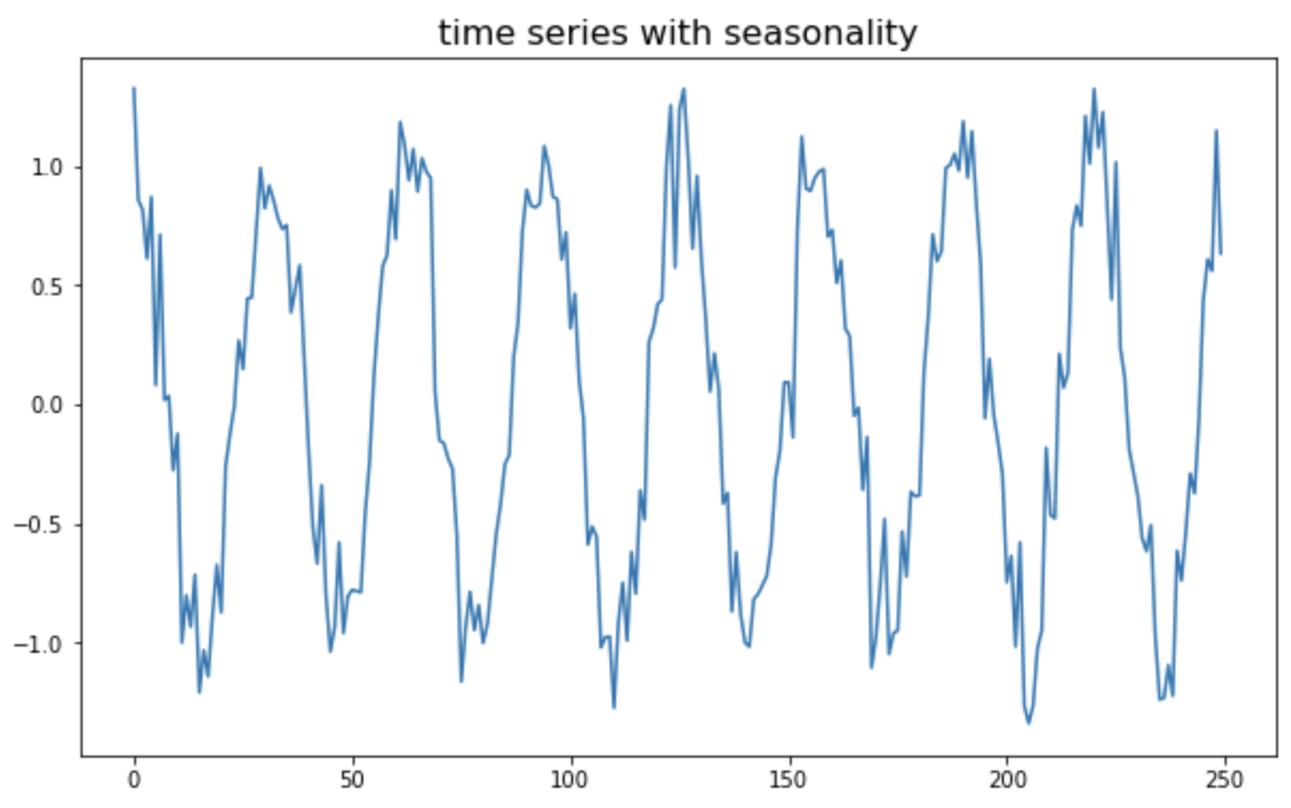
(4) 계절성을 가지는 비정상 시계열 데이터 (non-stationary time series with seasonality)
마지막으로, 코사인 주기의 계절성(seasonality)을 가지는 가상의 비정상(non-stationary) 시계열 데이터를 만들어보겠습니다.
## time series with seasonality
## generating x from 0 to 4pi and y using numpy
np.random.seed(1) # for reproducibility
x = np.arange(0, 50, 0.2) # start, stop, step
ts_seasonal = np.cos(x) + np.random.normal(0, 0.2, 250)

## ploting
plt.plot(ts_seasonal)
plt.title("time series with seasonality", fontsize=16)

plt.show()
time series with seasonality (non-stationary process)
(4-a) ADF 검정 (ADF test)
위의 계절성(seasonality)을 가지는 비정상 시계열에 대해서, ADF 검정(ADF test)을 실시하면, p-value가 3.14e-16 로서 유의수준 5% 하에서 귀무가설(H0: 단위근을 가진다. 즉, 정상 시계열이 아니다)를 기각하고, 대립가설(H1: 단위근을 가지지 않는다. 즉, 정상 시계열이다)를 채택합니다. (땡~! 틀림 -_-;;;)
## checking the stationarity of a series using the ADF(Augmented Dickey-Fuller) Test
# -- Null Hypothesis: The series has a unit root.(not stationary.)
# -- Alternate Hypothesis: The series has no unit root.(stationary.)

adf_test(ts_seasonal) # p-value 3.142783e-16 => stationary (Wrong result. -_-;;;)

# Results of Dickey-Fuller Test:
# Test Statistic                -9.516720e+00
# p-value                        3.142783e-16
# #Lags Used                     1.600000e+01
# Number of Observations Used    2.330000e+02
# Critical Value (1%)           -3.458731e+00
# Critical Value (5%)           -2.874026e+00
# Critical Value (10%)          -2.573424e+00
# dtype: float64
(4-b) KPSS 검정 (KPSS test)
위의 계절성(seasonality)을 가지는 비정상 시계열에 대해서, KPSS 검정(KPSS test)을 실시하면, p-value가 0.1 로서 유의수준 10% 하에서 귀무가설(H0: 정상 시계열이다)를 기각하고, 대립가설(H1: 정상 시계열이 아니다)를 채택합니다. (딩동댕! 맞음 ^_^) (ADF test 는 틀렸고, KPSS test 는 맞았어요. 유의수준 5% 하에서는 둘 다 틀림.)
## KPSS test for checking the stationarity of a time series.
## The null and alternate hypothesis for the KPSS test are opposite that of the ADF test.
# -- Null Hypothesis: The process is trend stationary.
# -- Alternate Hypothesis: The series has a unit root (series is not stationary).

kpss_test(ts_seasonal) # p-value 0.1 => non-stationary (at 10% significance level)

# Results of KPSS Test:
# Test Statistic           0.016014
# p-value                  0.100000
# Lags Used                9.000000
# Critical Value (10%)     0.347000
# Critical Value (5%)      0.463000
# Critical Value (2.5%)    0.574000
# Critical Value (1%)      0.739000
# dtype: float64
이상의 정상성 여부에 대한 통계적 가설 검정 결과를 보면,
(1) 정상 시계열에 대해 ADF test, KPSS test 모두 정상 시계열로 가설 검정 (모두 맞음 ^_^)
(2) 추세가 있는 시계열에 대해 ADF test, KPSS test 가 모두 정상 시계열이 아니라고 정확하게 가설 검정 (모두 맞음 ^_^)
(3) 분산이 변하는 시계열에 대해 ADF test 는 정상 시계열로 가설 검정 (틀렸음! -_-;;;), KPSS test 는 정상 시계열이 아니라고 가설 검정 (맞음 ^_^)
(4) 계절성이 있는 시계열에 대해 ADF test 는 정상 시계열로 가설 검정 (틀렸음! -_-;;;), KPSS test 는 정상 시계열이 아니라고 가설 검정 (맞음 ^_^)
ADF test 는 추세가 있는 비정상 시계열에 대해서는 정상 시계열이 아님을 잘 검정하지만,분산이 변하거나 계절성이 있는 시계열에 대해서는 정상성 여부를 제대로 검정해내지 못하고 있습니다.
반면에 KPSS test 는 위의 4가지의 모든 경우에 정상성 여부를 잘 검정해내고 있습니다.
통계적 가설 검정 외에 시계열 도표 (time series plot)을 꼭 그려보고 눈으로도 반드시 확인해보는 습관을 들이시기 바랍니다.
이번 포스팅에서는 Python을 사용해서 웹사이트에서 압축파일을 다운로드해서 압축을 해제하고 데이터셋을 합치는 방법을 소개하겠습니다.
세부 절차 및 이용한 Python 모듈과 메소드는 아래와 같습니다.
(1) os 모듈로 다운로드한 파일을 저장할 디렉토리가 없을 경우 새로운 디렉토리 생성하기
(2) urllib.request.urlopen() 메소드로 웹사이트를 열기
(3) tarfile.open().extractall() 메소드로 압축 파일을 열고, 모든 멤버들을 압축해제하기
(4) pandas.read_csv() 메소드로 파일을 읽어서 DataFrame으로 만들기
(5) pandas.concat() 메소드로 모든 DataFrame을 하나의 DataFrame으로 합치기
(6) pandas.to_csv() 메소드로 합쳐진 csv 파일을 내보내기
먼저, 위의 6개 절차를 download_and_merge_csv() 라는 이름의 사용자 정의함수로 정의해보겠습니다.
import os
import glob
import pandas as pd
import tarfile
import urllib.request

## downloads a zipped tar file (.tar.gz) that contains several CSV files,
## from a public website.
def download_and_merge_csv(url: str, down_dir: str, output_csv: str):
    """
    - url: url address from which you want to download a compressed file
    - down_dir: directory to which you want to download a compressed file
    - output_csv: a file name of a exported DataFrame using pd.to_csv() method
    """

    # if down_dir does not exists, then create a new directory
    down_dir = 'downloaded_data'
    if os.path.isdir(down_dir):
        pass
    else:
        os.mkdir(down_dir)

    # Open for reading with gzip compression.
    # Extract all members from the archive to the current working directory or directory path.
    with urllib.request.urlopen(url) as res:
        tarfile.open(fileobj=res, mode="r|gz").extractall(down_dir)

    # concatenate all extracted csv files
    df = pd.concat(
        [pd.read_csv(csv_file, header=None)
         for csv_file in glob.glob(os.path.join(down_dir, '*.csv'))])

    # export a DataFrame to a csv file
    df.to_csv(output_csv, index=False, header=False)
참고로, tarfile.open(fileobj, mode="r") 에서 4개의 mode 를 지원합니다.
tarfile(mode) 옵션 -. mode="r": 존재하는 데이터 보관소로부터 읽기 (read) -. mode="a": 존재하는 파일에 데이터를 덧붙이기 (append) -. mode="w": 존재하는 파일을 덮어쓰기해서 새로운 파일 만들기 (write, create a new file overwriting an existing one) -. mode="x": 기존 파일이 존재하지 않을 경우에만 새로운 파일을 만들기 (create a new file only if it does not already exist)
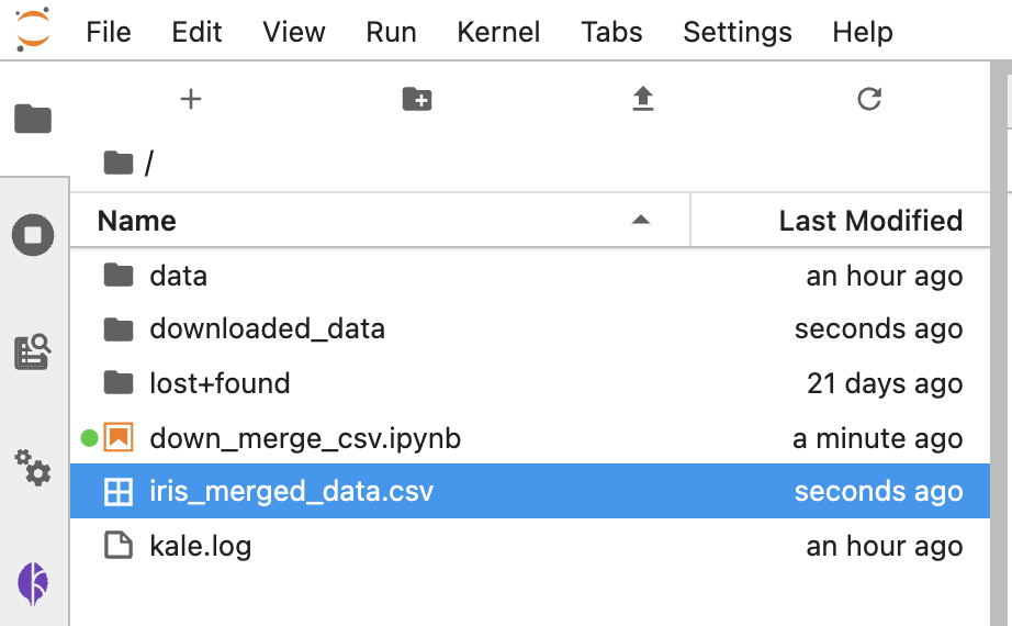
아래의 화면캡쳐처럼 'iris_merged_data.csv' 라는 이름의 csv 파일이 새로 생겼습니다. 그리고 'downloaded_data' 라는 폴더도 새로 생겼습니다.
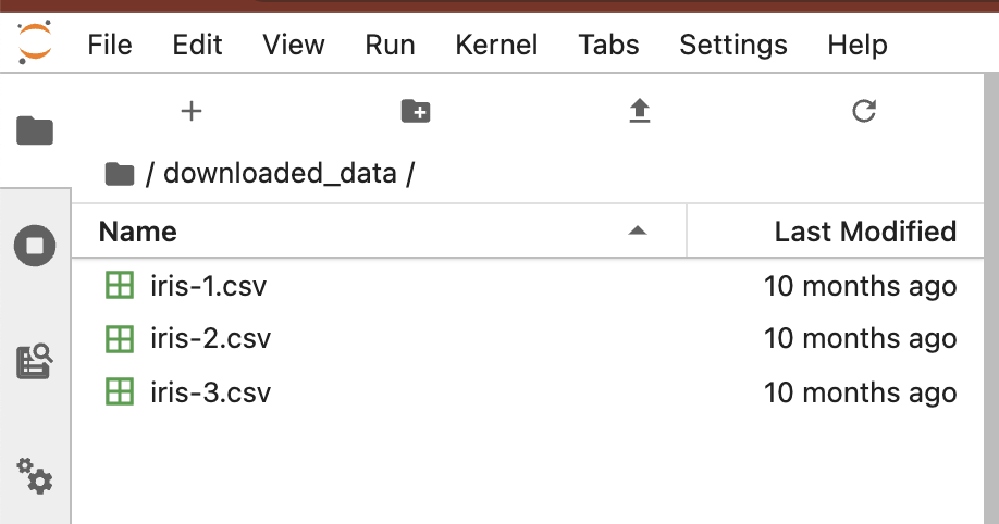
터미널에서 새로 생긴 'downloaded_data' 로 디렉토리를 이동한 다음에, 파일 리스트를 확인해보니 'iris-1.csv', 'iris-2.csv', 'iris-3.csv' 의 3개 파일이 들어있네요. head 로 상위의 10 개 행을 읽어보니 iris 데이터셋이군요.
jovyan@kubecon-tutorial-0:~$ ls
data  downloaded_data  down_merge_csv.ipynb  iris_merged_data.csv  kale.log  lost+found
jovyan@kubecon-tutorial-0:~$
jovyan@kubecon-tutorial-0:~$
jovyan@kubecon-tutorial-0:~$ cd downloaded_data/
jovyan@kubecon-tutorial-0:~/downloaded_data$ ls
iris-1.csv  iris-2.csv  iris-3.csv
jovyan@kubecon-tutorial-0:~/downloaded_data$
jovyan@kubecon-tutorial-0:~/downloaded_data$
jovyan@kubecon-tutorial-0:~/downloaded_data$ head iris-1.csv
5.1,3.5,1.4,0.2,setosa
4.9,3.0,1.4,0.2,setosa
4.7,3.2,1.3,0.2,setosa
4.6,3.1,1.5,0.2,setosa
5.0,3.6,1.4,0.2,setosa
5.4,3.9,1.7,0.4,setosa
4.6,3.4,1.4,0.3,setosa
5.0,3.4,1.5,0.2,setosa
4.4,2.9,1.4,0.2,setosa
4.9,3.1,1.5,0.1,setosa
jovyan@kubecon-tutorial-0:~/downloaded_data$