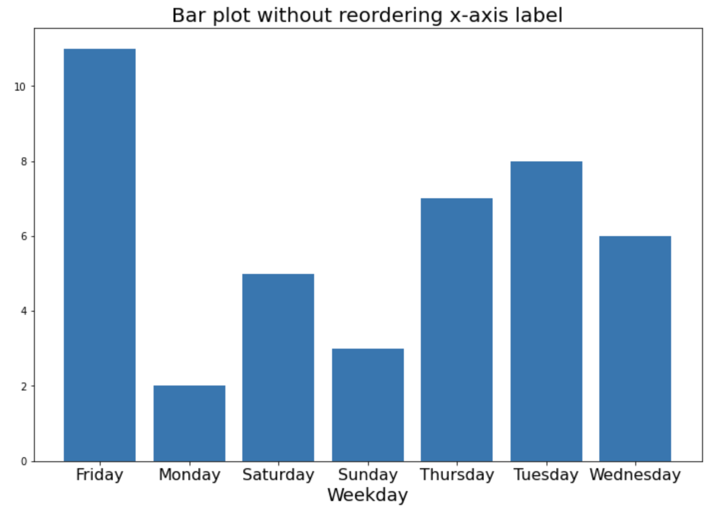
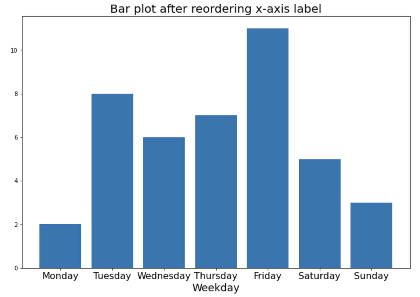
산점도 (Scatter plot) 가 두 변수 간의 관계를 2차원(2D으로 시각화해서 볼 수 있는 그래프라면, 버블 그래프(Bubble chart)는 산점도에 버블의 크기와 색깔을 추가하여 3차원(3D) 또는 4차원(4D)의 정보를 2차원에 시각화해서 볼 수 있는 그래프입니다. 그리고 시간 축을 추가하여 애니메이션 형태의 버블 그래프를 그린다면 5차원(5D)의 시각화도 가능합니다.
이번 포스팅에서는 Python의 matplotlib, seaborn, plotly, bubbly 등의 시각화 모듈을 이용해서 버블 그래프를 그리는 방법을 소개하겠습니다.
(1) matplotlib 으로 버블 그래프 그리기 (Bubble chart using Matplotlib)
(2) seaborn 으로 버블 그래프 그리기 (Bubble chart using Seaborn)
(3) plotly 로 동적인 버블 그래프 그리기 (Interactive Bubble chart using Plotly)
(4) bubbly 로 시간의 흐름에 따라 변화하는 버블 그래프 그리기 (Animated Bubble chart using bubbly)
plotly 모듈에 들어있는 Gapminder Global Indicator 데이터셋을 대상으로 버블 그래프를 그려보겠습니다. x 축에는 gpdPercap, y 축에는 lifeExp 를 사용하겠으며, pop 에 비례해서 버블의 크기를 조절하고, continent 에 따라서 버블의 색깔을 다르게 해보겠습니다.
## importing modules
import matplotlib.pyplot as plt
import seaborn as sns
import plotly.express as px
import pandas as pd
import numpy as np

## getting dataset
df = px.data.gapminder()


df.info()
# <class 'pandas.core.frame.DataFrame'>
# RangeIndex: 1704 entries, 0 to 1703
# Data columns (total 8 columns):
#  #   Column     Non-Null Count  Dtype
# ---  ------     --------------  -----
#  0   country    1704 non-null   object
#  1   continent  1704 non-null   object
#  2   year       1704 non-null   int64
#  3   lifeExp    1704 non-null   float64
#  4   pop        1704 non-null   int64
#  5   gdpPercap  1704 non-null   float64
#  6   iso_alpha  1704 non-null   object
#  7   iso_num    1704 non-null   int64
# dtypes: float64(2), int64(3), object(3)
# memory usage: 106.6+ KB


df.head(3)
# 	country	continent	year	lifeExp	pop	gdpPercap	iso_alpha	iso_num
# 0	Afghanistan	Asia	1952	28.801	8425333	779.445314	AFG	4
# 1	Afghanistan	Asia	1957	30.332	9240934	820.853030	AFG	4
# 2	Afghanistan	Asia	1962	31.997	10267083	853.100710	AFG	4


df.year.max() # ==> keep year 2007
# 2007


df.gdpPercap.describe()   # right-skewed => log scaling
# count      1704.000000
# mean       7215.327081
# std        9857.454543
# min         241.165877dd
# 25%        1202.060309
# 50%        3531.846989
# 75%        9325.462346
# max      113523.132900
# Name: gdpPercap, dtype: float64
(1) matplotlib 으로 버블 그래프 그리기 (Bubble chart using Matplotlib)
matplotlib.pyplot.scatter() 메소드를 사용해서 산점도를 그리면서, 버블의 크기(s)와 색깔(c)을 추가로 지정해주면 됩니다. continent 별로 색깔을 다르게 지정해주었는데요, 아래의 범례(plt.legend()) 설정 방법 참고하세요. alpha=0.5 로 버블이 겹쳤을 때 파악할 수 있도록 투명도를 설정해주었습니다.
x축의 gdpPercap 변수가 왼쪽으로 값이 많이 쏠려있는 형태를 띠고 있으므로 plt.xscale('log') 을 사용해서 x축을 로그 변환 (log transformation) 해주었습니다. plt.grid() 로 점선을 사용해서 그리드 선을 추가해주었습니다.
## (1) Bubble chart with Matplotlib
fig = plt.figure(figsize=(16, 9))
df_2007 = df[df['year']==2007]

ax = plt.scatter(
    x = df_2007['gdpPercap'],
    y = df_2007['lifeExp'],
    s = df_2007['pop']/300000,
    c = pd.Categorical(df_2007['continent']).codes,
    cmap = "Accent",
    alpha = 0.5,
    edgecolors = "gray",
    linewidth = 1);

plt.xscale('log') # log scaling
plt.xlabel("GDP per Capita")
plt.ylabel("Life Expectancy")
plt.title('Gapminder Global Indicators with Matplotlib', fontsize=16)
plt.grid(True, which='major', linestyle='--', linewidth=0.5)
## setting legend using colors in matplotlib scatter plot
plt.legend(
    handles=ax.legend_elements()[0],
    labels=['Asia', 'Europe', 'Africa', 'Americas', 'Oceania'])

plt.show()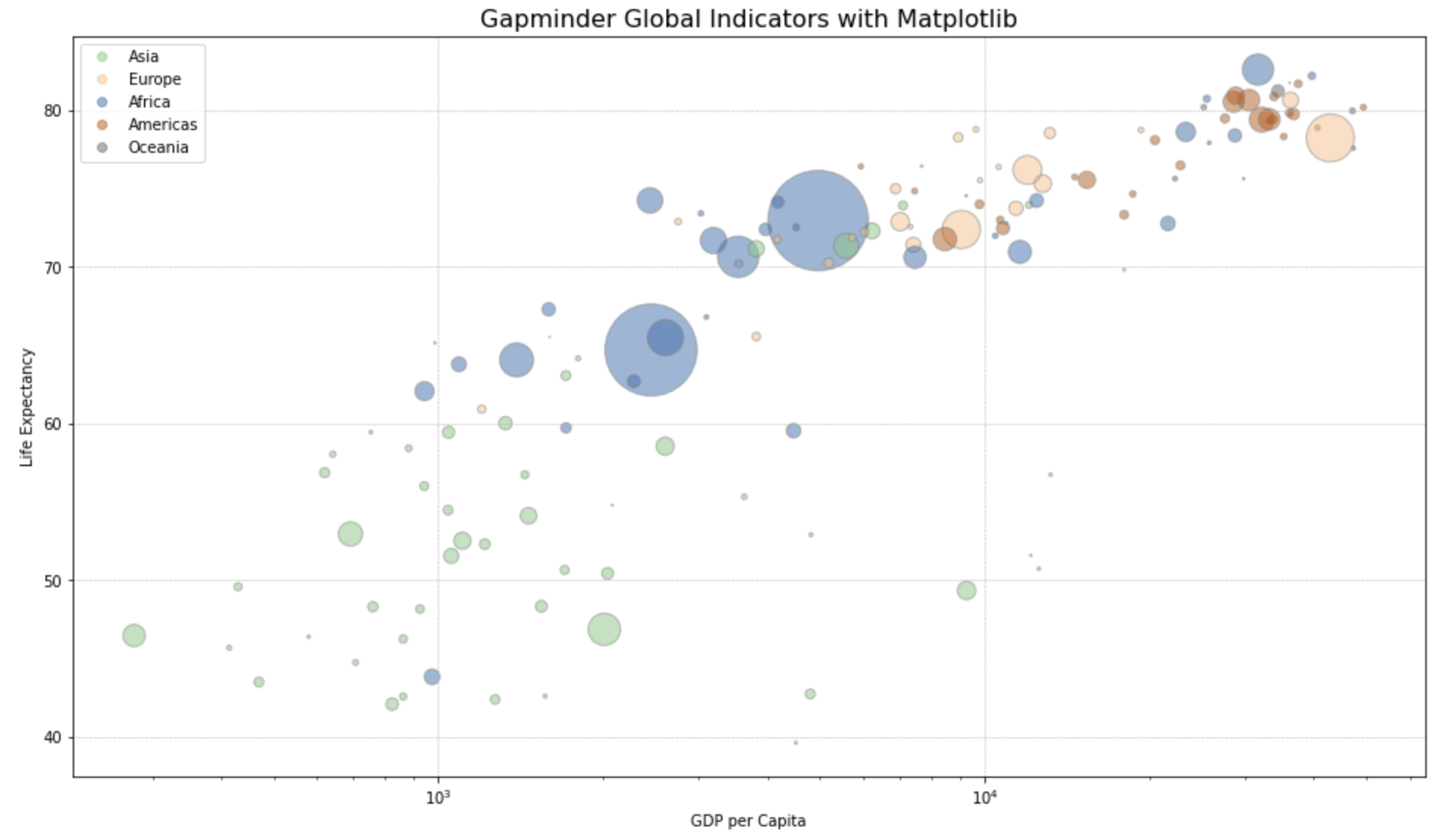
(2) seaborn 으로 버블 그래프 그리기 (Bubble chart using Seaborn)
위의 matplotlib 대비 seaborn.scatter() 메소드는 x축, y축, size, hue(그룹별 색깔 구분) 을 각각 지정해줄 수 있어서 비슷한데요, legend=True 로 지정해주면 size 와 hue (그룹별 색깔 구분) 에 대한 범례를 자동으로 추가해주어서 편리합니다.
## (2) Bubble chart with Seaborn
fig = plt.figure(figsize=(16, 9))
df_2007 = df[df['year']==2007]

sns.scatterplot(
    data = df_2007,
    x = "gdpPercap",
    y = "lifeExp",
    size = "pop",
    hue = "continent",
    legend = True,
    sizes = (20, 2000) ,
    alpha=0.5
)

plt.xscale('log') # log scaling
plt.xlabel("GDP per Capita")
plt.ylabel("Life Expectancy")
plt.title('Gapminder Global Indicators with Seaborn', fontsize=16)
plt.grid(True, which='major', linestyle='--', linewidth=0.5)
plt.show()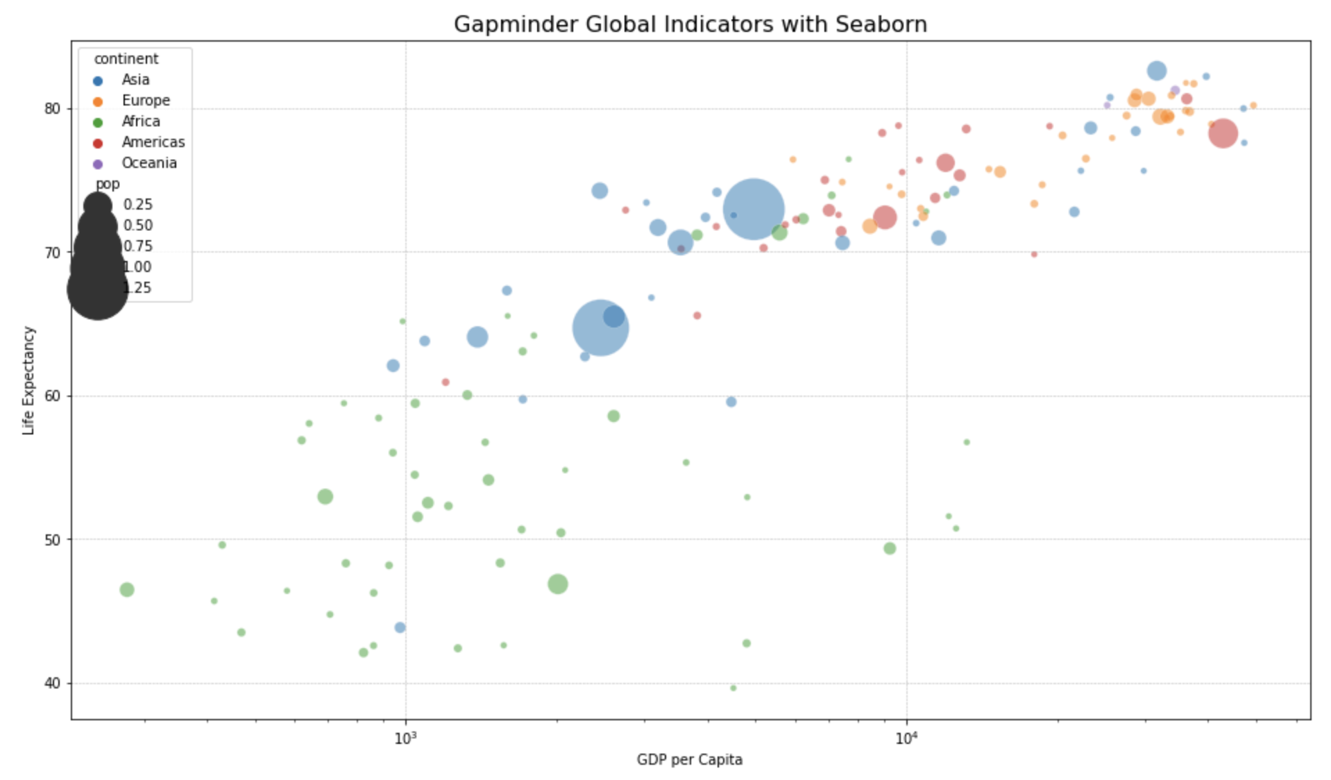
(3) plotly 로 동적인 버블 그래프 그리기 (Interactive Bubble chart using Plotly)
plotly 는 위의 matplotlib, seaborn 대비 사용자가 커서를 사용해서 동적으로 버블 그래프(interactive bubble chart)를 조회할 수 있다는 점입니다. hover_name="country" 를 지정해주면 버블 위에 커서를 가져다 놓을 경우 국가 이름과 함께 x축, y축, 버블 크기, 색깔 지정 정보를 팝업 메시지로 보여줍니다. 그리고 커서로 블록을 설정해주면 해당 블록에 대해 줌인(zoom in) 해서 확대해주는 기능도 있습니다. 그 외에 첫번째 줄의 df.query("year==2007") 처럼 px.scatter() 함수 안에서 데이터의 subset 을 query 해서 쓸 수 있으며, log_x = True 를 설정하면 x축의 값을 로그 변환하도록 설정해줄 수도 있습니다. 코드가 매우 깔끔하고 그래프가 이쁜데다 동적이기까지 해서 가독성이 매우 뛰어나기 때문에 왠만하면 matplotlib 이나 seaborn 대신에 plotly 를 사용하는 것이 사용자 입장에서는 좋을 것 같아요.
## (3) Bubble chart with Plotly
import plotly.express as px

fig = px.scatter(
    df.query("year==2007"),
    x="gdpPercap",
    y="lifeExp",
    size="pop",
    color="continent",
    hover_name="country",
    log_x=True,
    title='Gapminder Global Indicators with Plotly',
    size_max=60,
    height=650)

fig.show()
아래의 Plotly 로 그린 버블 그래프의 버블 위에 커서를 가져가면 뜨는 캡션 정보와, 커서로 블록을 선정해서 hover 해서 zoom in 하는 모습을 화면 녹화한 것이예요. 코드 몇줄로 이게 된다는게 신기하지요?! plotly 짱! ^^
(4) bubbly 로 시간의 흐름에 따라 변화하는 버블 그래프 그리기 (Animated Bubble chart using bubbly)
이번에는 시간 축을 추가 (adding timestamp axis)해서 시간의 흐름에 따라서 버블 그래프가 변화하는 애니메이션을 시각화 해보겠습니다. bubbly 모듈의 bubbleplot() 메소드를 사용하며, time_column='year' 에 년도(year)를 시간 축으로 설정해주었습니다. x축은 x_column, y축은 y_column, 버블 크기는 size_column, 버블 색깔은 color_column 로 설정해주면 됩니다. x_logscale=True 로 x축 값을 로그 변환해주었으며, scale_bubble=3 으로 버블의 스케일을 지정해주었습니다.
#!pip install bubbly

## (4) Animated Bubble Chart
## Using the function bubbleplot from the module bubbly(bubble charts with plotly)
## ref: https://github.com/AashitaK/bubbly

from bubbly.bubbly import bubbleplot
from __future__ import division
from plotly.offline import init_notebook_mode, iplot
init_notebook_mode()

figure = bubbleplot(
    dataset=df,
    x_column='gdpPercap',
    y_column='lifeExp',
    bubble_column='country',
    time_column='year',
    size_column='pop',
    color_column='continent',
    x_title="GDP per Capita",
    y_title="Life Expectancy",
    title='Animated Gapminder Global Indicators with Bubbly',
    x_logscale=True,
    scale_bubble=3,
    height=650)

iplot(figure, config={'scrollzoom': True})
아래는 애니메이션 버블 차트를 실행시킨 모습을 화면 녹화한 것이예요. 왼쪽 하단의 'Play' 버튼을 누르면 애니메이션이 실행이 되면서 년도의 순서대로 버블 차트가 변화는 것을 볼 수 있습니다. 신기하지요?! ^^ bubbly 짱!! (bubbly 의 백본이 plotly 이므로 역시 plotly 짱!!)
이번 포스팅이 많은 도움이 되었기를 바랍니다.
행복한 데이터 과학자 되세요! :-)